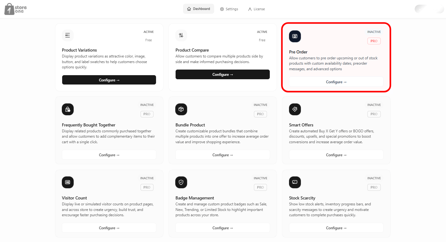
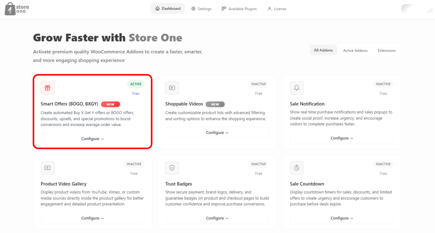
This plugin eases your life as several Modules are integrated into a single plugin. You can easily enable a functionality using a button and add it to your site.
This is the very first step. This will help you install the Store One plugin in your WordPress dashboard.
Step 1: Go to the Store One page. Click on Try Free.
Step 2: Open your WordPress dashboard. Go to Plugins > Add Plugin. Click on Upload Plugin and upload the plugin. After uploading, activate the plugin.
After Activation, the plugin will appear in your dashboard menu as Store One. Click on Store One.
Smart Offers
Smart Offers Addon lets you create automated deals like BOGO or quantity discounts to lift sales and increase average order values.
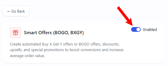
Open your Store One dashboard and click on the Smart Offer addon’s Configure button
Enable the addon
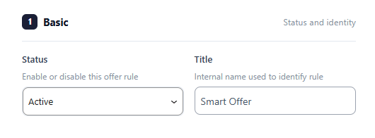
Settings
Status: This acts like an on/off switch. Set it to Active to make the deal live on your store, or Inactive to pause it.
Title: A private name box used to label your deal so you can easily find and organize it inside your website dashboard.
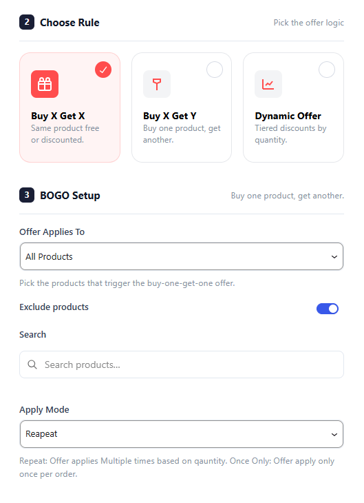
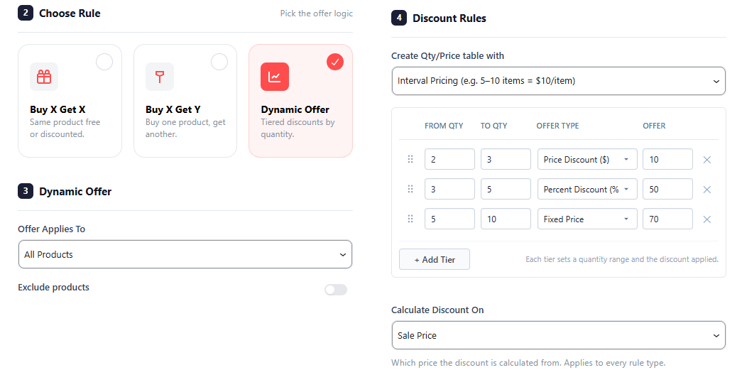
Choose Rule: The core setting that determines your type of sale. Choosing a rule here completely changes the options that appear in the Offer Rules section below.
Choose Rule
Offer A: “Buy X Get X” (Same Product Discount)
Use this setup to give a discount on the exact same product the customer is already purchasing (e.g., Buy 2 of Item A, get the 3rd Item A at 50% off).
Quantity: Type the exact number of items a customer must buy to unlock the deal.
Discount on X Product: Choose the type of reward your customer gets, such as giving the extra item completely free (Free) or offering it at a set percentage off (Percentage).
Value: Enter the exact number for your discount, like typing 50 if you selected a percentage discount to give them 50% off the extra item
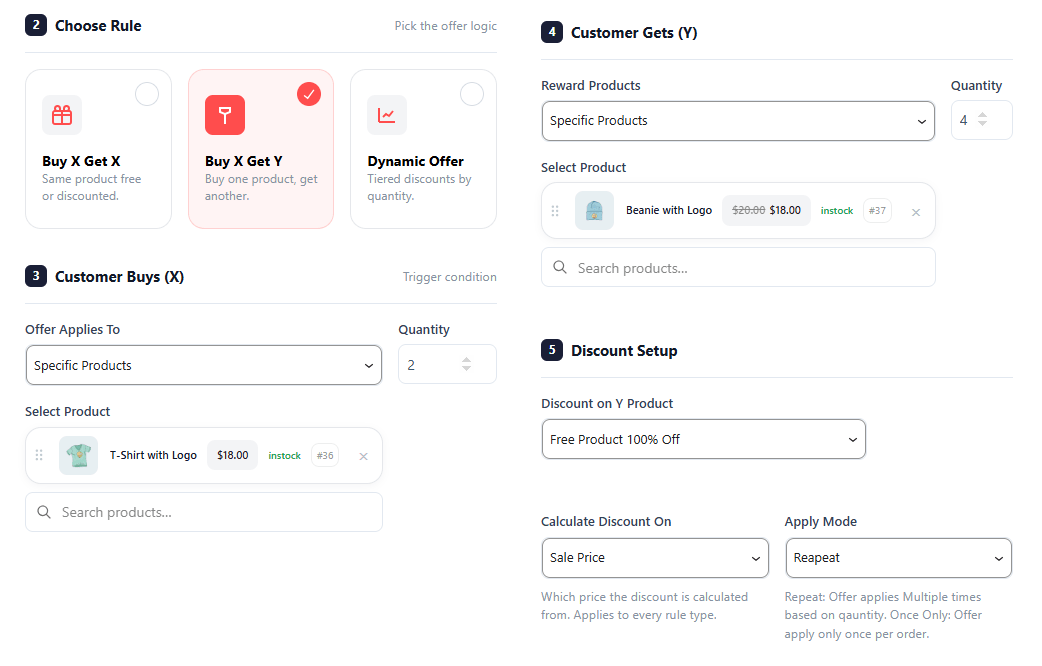
Variation B: “Buy X Get Y” (Different Product Discount)
Use this setup to reward customers with a discount on a completely different product when they buy an item from you (e.g., Buy a Camera, get a Memory Card free).
Quantity: Enter the number of items a customer must buy from your store to trigger this offer.
Select Product: Search and select the exact reward item from your catalog that your customer will receive as a bonus.
Discount on Y Product: Choose how you want to discount this second item, such as making it completely free or giving a specific percentage cut.
Value: Type the size of the discount here (for example, typing 100 alongside the percentage option to make the second item 100% free).
Use this setup to build a tiered pricing table where items automatically get cheaper the more copies a customer buys (e.g., Buy 1-4 for ₹100 each, Buy 5+ for ₹80 each).
Create Qty/Price table with: Choose how you want to structure your bulk steps, letting you pick between precise number ranges (like 5 to 10 items) or simple quantity milestones.
Calculate Discount On: Tell the system how to calculate the price cuts, letting you subtract the discount from the item’s original Regular Price or from its already marked-down Sale Price.
Display
These settings control the physical location of the offer block on your store’s live layout.
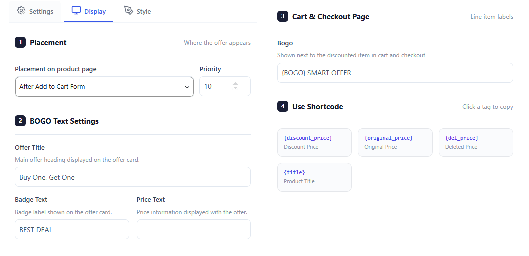
Placement on product page: This dropdown menu lets you choose the exact spot on your item pages where the offer block will show up, such as right after the “Add to cart” form.
Priority: This number box lets you set the loading order of the offer block, which is helpful if you have other widgets on the same page and want this deal to load higher up or lower down.
This section automatically changes its fields to match the specific marketing messages required for your active deal type.
Variation A: BOGO Text Settings
Use these fields to customize text when running a standard Buy One, Get One style deal.
2. BOGO Text Settings
This section dynamically updates to let you customize text messages specifically tailored for Buy One, Get One style promotions.
Offer Title: This is a text box where you type the main headline for your sale (like “Buy One, Get One”) that instantly catches the customer’s eye at the top of the offer card.
Badge Text: This box lets you customize the short text written inside a highlighted colorful sticker—such as “BEST DEAL”—to draw attention to the savings.
Price Text: This field allows you to customize how pricing details are written out, letting you display original prices right next to your special offer prices.
3. Cart & Checkout Page
This section handles the labels that display once an item is added to the cart.
Bogo: Type a custom label (like {BOGO} SMART OFFER) that will show up directly next to discounted items inside the shopping cart and checkout screens, making it clear to the customer that the deal has successfully applied.
4. Use Shortcode
These are clickable template tags that make it easy to display real-time, accurate product details without having to update the text manually for every single item.
Shortcode Tags: Click on any of the provided tags to copy them. You can paste these into your text fields to automatically pull and display live product titles, original prices, or discount amounts directly to the shopper.
Variation B: Buy X Get Y Text Settings
Settings of No 2,3, and 4 changed on the basis of the Rule you selected.
Use these fields when you are gifting a completely different reward product to the customer.
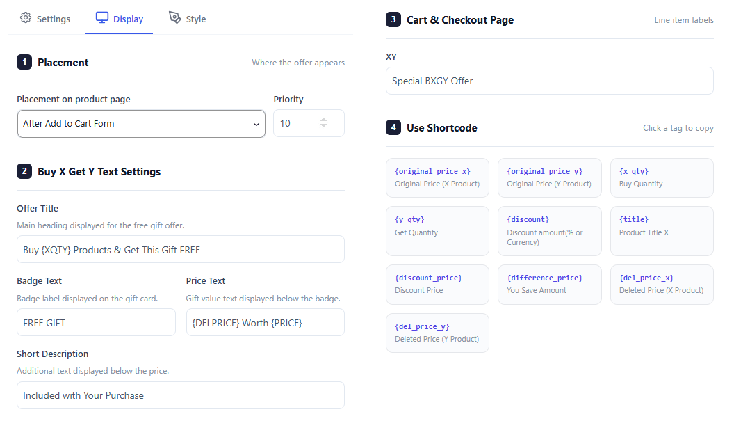
2. Buy X Get Y Text Settings
This section dynamically updates to let you customize text messages specifically tailored for cross-product rewards and free gift promotions.
Offer Title: This is a text box where you type the main headline for your sale (like “Buy {XQTY} Products & Get This Gift FREE”) that instantly catches the customer’s eye at the top of the offer card.
Badge Text: This box lets you customize the short text written inside a highlighted colorful sticker—such as “FREE GIFT”—to draw attention to the reward.
Price Text: This field allows you to customize how the gift value text is written out, letting you display original crossed-out prices right next to the special offer values below the badge.
Short Description: This text area lets you add a quick, helpful sentence right below the price to explain simple deal rules, such as letting users know the item is “Included with Your Purchase.”
3. Cart & Checkout Page
This section handles the labels that display once an item is added to the cart.
XY: Type a custom label (like “Special BXGY Offer”) that will show up directly next to discounted items inside the shopping cart and checkout screens, making it clear to the customer that the deal has successfully applied.
4. Use Shortcode
These are clickable template tags that make it easy to display real-time, accurate product details without having to update the text manually for every single item.
Shortcode Tags: Click on any of the provided tags to copy them. You can paste these into your text fields to automatically pull and display live product details, original prices, buy/get quantities, or discount amounts directly to the shopper.
Variation C: Dynamic Offer Text Settings
Use these fields when setting up multi-item tiered bulk discounts.
2. Dynamic Offer Text Settings
This section dynamically updates to let you customize text messages specifically tailored for tiered bulk discount tables and quantity milestones.
Offer Title: This is a text box where you type the main headline for your tiered sale (like “Buy from {XQTY} to {YQTY} items for {DISCOUNT} OFF per item”) to let customers know how many items unlock a price drop.
Badge Text: This box lets you customize the short text written inside a highlighted colorful sticker—such as “Save {DISCOUNT}”—to visually pop out the savings amount.
Price Text: This field allows you to customize how your pricing text details are written out, letting you display the original prices right next to the active promotional prices.
Short Description: This text area lets you add a quick, simple line of text right below the pricing block to clarify rules, such as breaking down the discount to a single item view (like “{DISCOUNT} / each item”).
3. Cart & Checkout Page
This section handles the custom promotional text labels displayed inside shopping carts and final checkout pages.
Dyanamic: Type a custom label (like “Dynamic Discount”) that will show up directly next to discounted line items to prove to the customer that their bulk quantity discount was successfully calculated.
4. Use Shortcode
These are template tags that pull live database data to update your promotional text instantly for every unique product on your site.
Shortcode Tags: Clicking on any of the provided tags copies them to your clipboard so you can paste them into your text fields.
Style
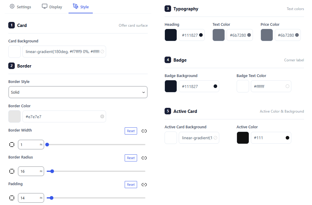
The Style Settings Tab gives you complete visual control over your offer blocks, making it easy to match the design to your website’s branding. You can customize the main card background with colors or gradients, pick a border style, and use sliders to adjust the border width, corner roundness, and inner padding. You can also choose a unique background color to highlight the card when a customer clicks to select it.
For text and callouts, you have full color control over the headings, main body text, and product prices to ensure your promotion is perfectly readable. Additionally, you can style the promotional corner badge by selecting a contrasting background and clear text color to make your discount savings instantly pop out to shoppers.
Backend Preview
The Live Preview Section shows exactly how your discount offers look to customers on your store pages. It automatically updates whenever you select a new rule type, ensuring your design matches your website branding perfectly.
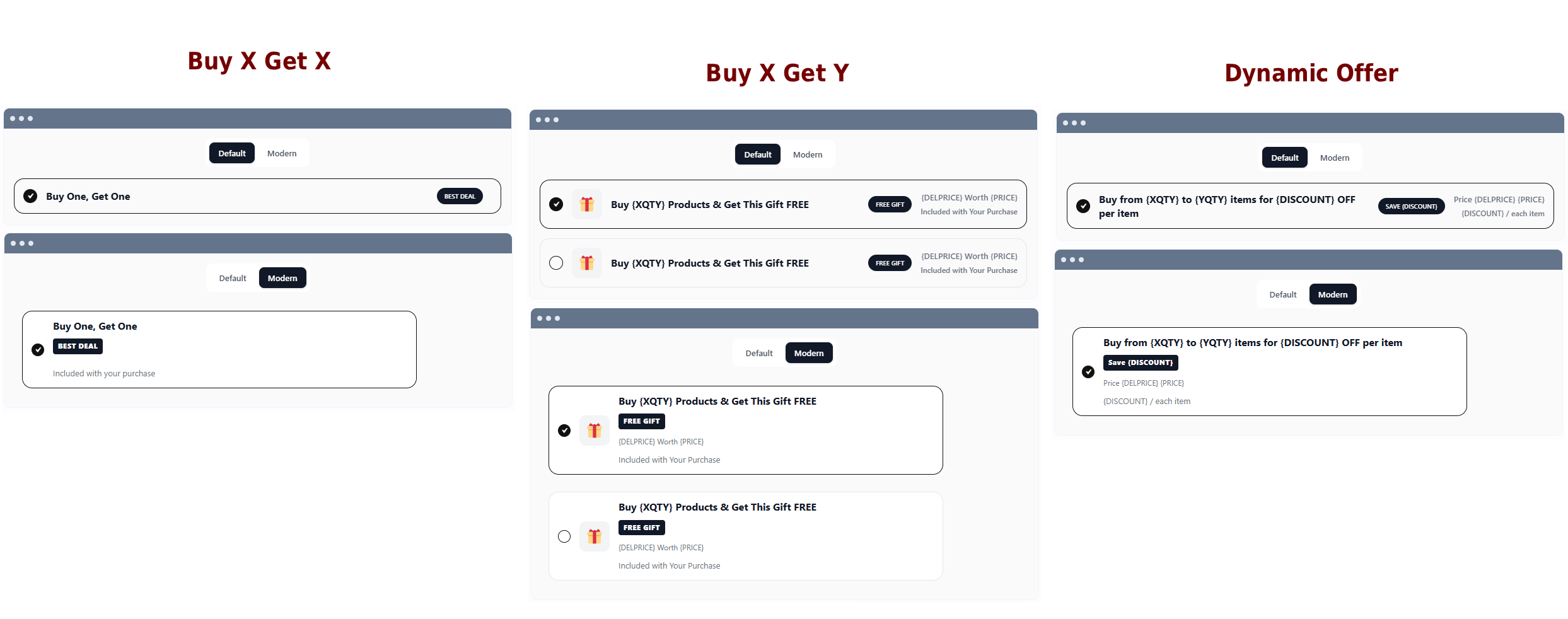
Every layout supports two unique visual themes: Default for a clean horizontal row that fits tight layouts, and Modern for a stacked card container that draws more attention to your sales.
Buy X Get X Preview: Shows your “Buy One, Get One” title in a streamlined row or block, complete with a clean selection checkmark on the left and a prominent high-contrast badge on the right to encourage quick checkouts.
Buy X Get Y Preview: Adds a decorative gift icon alongside choice checkboxes, clearly formatting your reward title, a “FREE GIFT” badge, and your item value text to make cross-sell bonuses instantly clear.
Dynamic Offer Preview: Outlines your bulk tiered pricing table directly to the shopper, cleanly breaking down the quantity ranges needed to trigger a price drop alongside the corresponding discount per item.
Frontend Preview
Buy X Get X
This shows the BOGO deal box directly on the product page. Customers can select the “Buy One, Get One” offer via a radio button to instantly claim the promotion.
Buy X Get Y
This page displays a free gift cross-sell offer right below the main checkout actions. It cleanly shows customers the gift description, its total worth, and an eye-catching “FREE GIFT” badge.
Dynamic Offer
This shows a tiered bulk pricing setup directly below the checkout button. Customers see multiple quantity ranges, custom discount badges, and slashed prices, encouraging them to buy more items.
Watch the Documentation Walkthrough.
Shoppable Videos
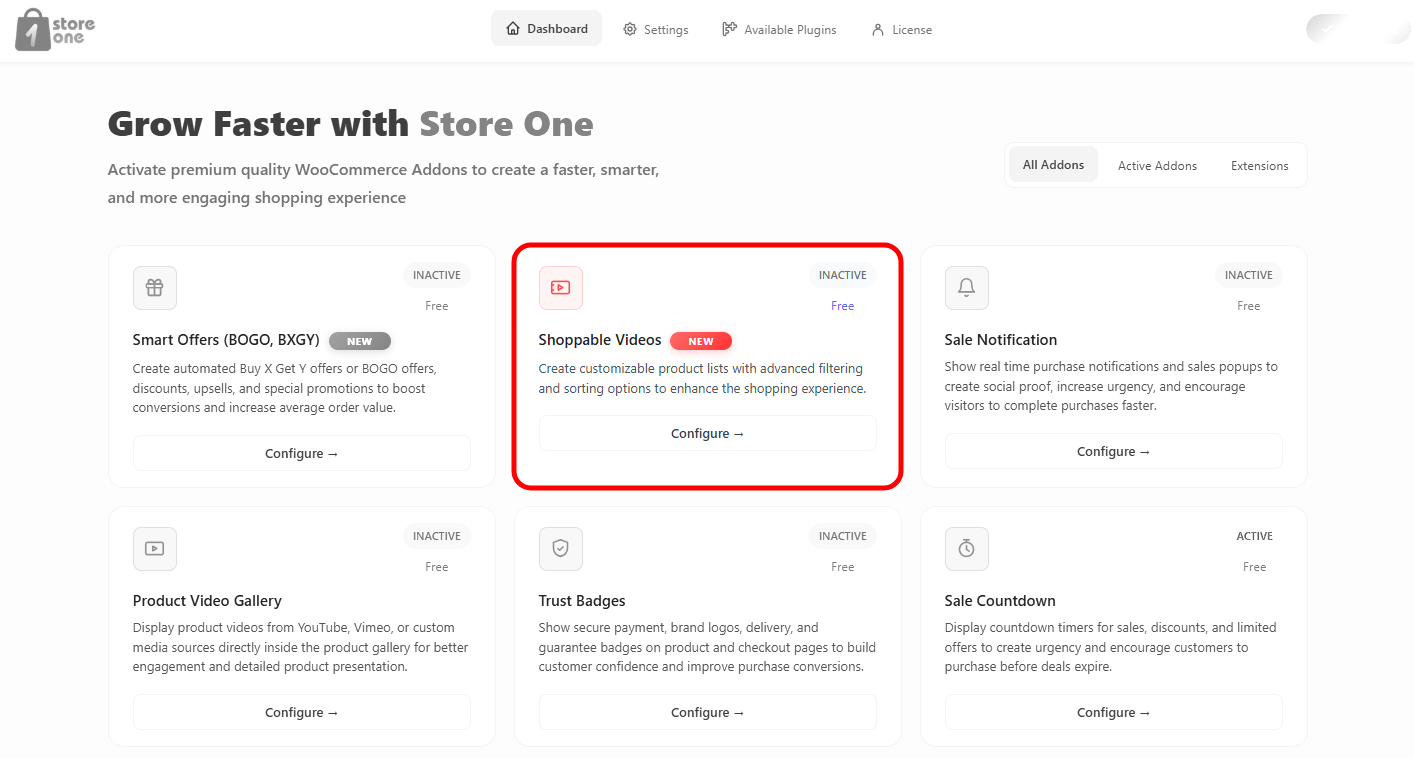
Open the Store One dashboard and click on the Shoppable Video addon’s Configure button.
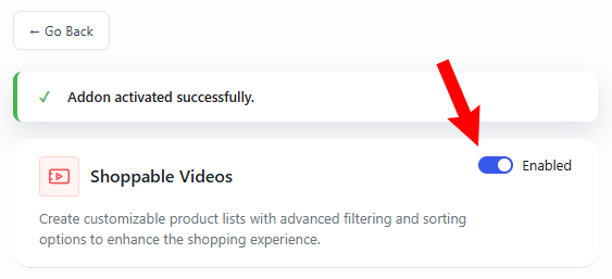
Enable the addon
Settings
1. Basic Settings
This configuration panel controls whether the addon functionality is live on your store.
Status: Change this dropdown to Active to turn the addon features on, or Inactive to temporarily disable them.
2. Shoppable List Item
This section allows you to attach interactive videos to your items. Customers can watch a video demonstration and buy the featured product directly from the video player.
Product List Items
You can create multiple product list groupings. Each group contains specific video elements.
Add List Item Button: Click this link to create a brand-new product listing group.
Add Video Product Button: Click the + Add Video Product card inside a group to attach a new video container to that specific list.
Video Product Settings
Each individual video product block contains the following configuration options:
Video Upload / Preview: View your current video asset thumbnail. Click Change to upload a new video file or swap the active clip.
Category Filter: Use the dropdown menu to filter your items by a specific category (e.g., All Categories) to find your products faster.
Attached Product Card: Displays the item currently linked to the video player along with its live price, stock status, and ID tag. Click the X icon to detach it.
Search products Field: Type the name of any item in your catalog here to quickly find and link it to this video container.
Delete Icon: Click the trash can icon at the top right of any video block to completely remove that video product from your list.
The Shoppable List is highly flexible, allowing you to organize your multimedia shopping experience in two distinct ways:
Multiple Products inside One Card: You can stack several different product videos inside a single Product List Item card. This is perfect for creating a curated collection (like a “Summer Outfit Collection”) where customers can scroll through a series of connected product videos within one layout block.
Creating Separate Cards: If you want to display your video items in completely separate sections or locations on your store, you can click + Add List Item to generate an entirely new, independent card block with its own unique settings.
3. Content Settings
This section controls the playback behavior of your videos, popup interactions, and how to embed the shoppable video list onto your website.
Playback Options
Video Auto Play: Turn this switch on to automatically start playing your videos. It will switch to the next product item automatically based on your custom delay or when the video ends.
All Video Auto Play: Turn this switch on to enable simultaneous automatic playback for all videos in the list view.
Mute: Switch this toggle on to automatically unmute your video playback. Turning this on ensures the audio plays instantly without requiring the user to click an unmute icon.
Delay (ms): Enter a time value in milliseconds to control exactly how long a single product stays visible. If you leave this box completely empty, the product will remain on screen for the full duration of its attached video file.
Popup & Embedding Options
Product Info Showing in Popup: Turn this toggle switch on to open up an interactive popup window displaying complete product information whenever a customer clicks on an item in the list.
Shortcode: Copy the unique generated piece of code from this box by clicking the copy icon. Paste this code snippet into any post, page layout, sidebar widget, or page builder section to display your interactive Shoppable Videos.
Display Design
The Display Page tab allows you to configure the heading text and structural elements that appear right above your interactive video section on the front-end.
1. Title Settings
This section handles the styling and visibility of your section header.
Title: Enter the custom text header you want customers to see above the video block (e.g., Shoppable Videos).
Title HTML tag: Select the structural text size tag from the dropdown list (e.g., H2). This helps match your site’s SEO layout styling rules.
Hide title: Turn this toggle switch on if you want to completely hide the heading text and display only the videos.
2. Layout Settings
This section helps you choose between a grid structure or a sliding carousel layout to present your video blocks.
Display Mode
Display in Slider: Turn this toggle switch on to arrange your videos in a swipeable slider carousel. Keep it turned off to present your videos in a standard row-and-column layout.
Hide Inherit Navigation: Turn this switch on to hide default theme arrow buttons from appearing over the design block.
Grid Sizing
Columns: Drag the slider or type a value to choose how many video blocks display side-by-side in one row.
Columns Gap: Drag the slider or enter a number to adjust the spacing between each video card container box.
Design
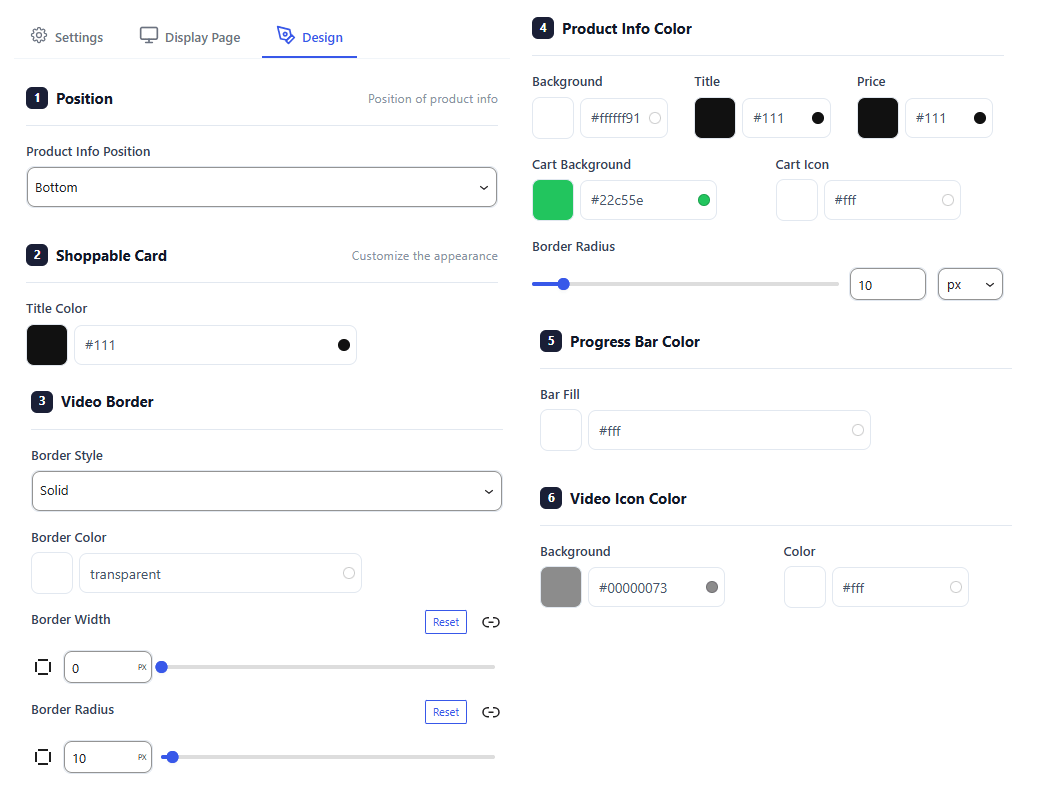
The Design tab lets you customize how your shoppable video blocks look to match your store’s style.
Position: Choose where the product details box sits over your video (e.g., Bottom).
Shoppable Card: Set the text color for your main product titles.
Video Border: Customize the frame style, color, line thickness, and corner roundness of your video panels.
Product Info Color: Pick colors for the product background banner, text, price tag, and “Add to Cart” button.
Progress Bar Color: Choose the color of the moving timeline tracker that displays video playback length.
Video Icon Color: Adjust the background shade and symbol colors for the play and pause buttons.
Backend Preview
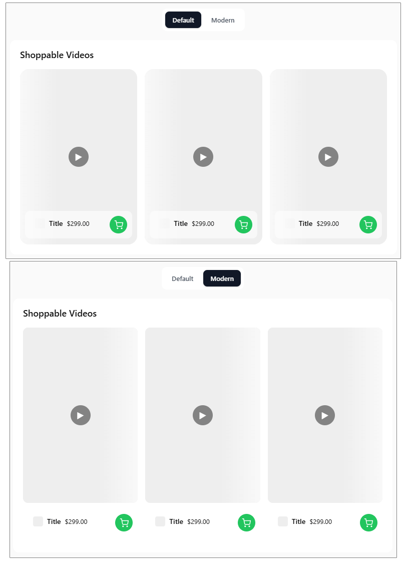
The plugin offers 2 distinct visual presets to quickly change how your interactive video cards look on your storefront.
Default Preset: Displays product details inside a structured overlay box that sits on top of the video clip background.
Modern Preset: Displays product details completely outside and below the video clip container for a clean look.
Frontend Preview
This is how the Shoppable Videos section looks to your customers on the front-end of your store.
Interactive Controls: Up and down navigation arrows allow customers to quickly cycle through multiple product videos stacked inside a single card container.
Product Badge: Displays a miniature image thumbnail, product title, and live pricing right next to the video playback area.
Quick Purchase Button: Customers can click the prominent green shopping cart icon to add the featured item straight to their cart without leaving the video screen.
When a customer clicks on a video product item, a comprehensive interactive popup window opens up immediately.
From this interface, users can watch product videos, cycle through items, and adjust quantities. They can also view full product pages or instantly add items directly to their cart.
Featured List
This Module helps you add a list of something, it can be features, brands, functions, or anything, to the single page of a product.Let’s explore its features.
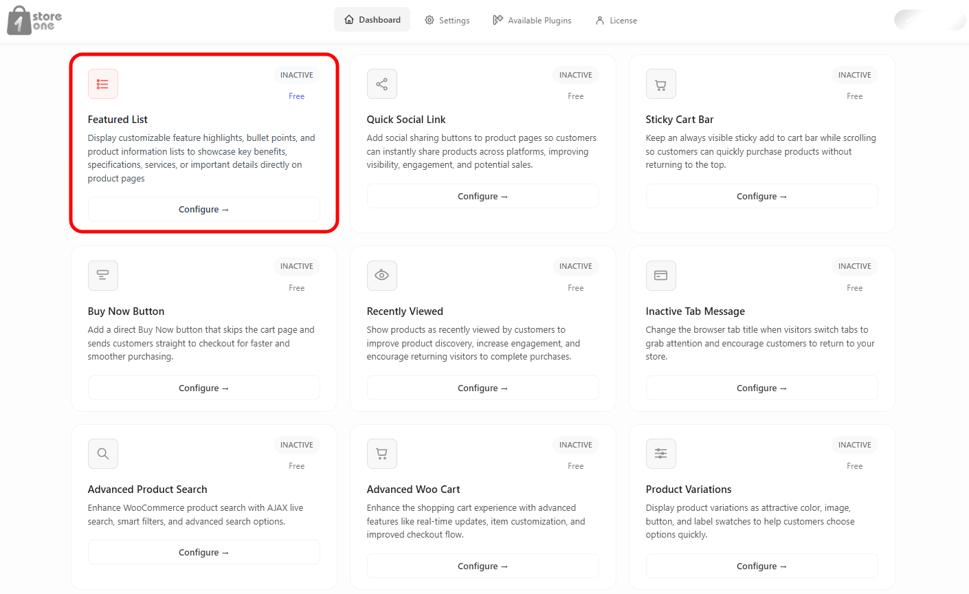
From your Store One dashboard, click on the Configure button of the Featured List
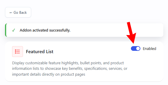
Enable the addon.
You will see it’s all the settings on this page.
Settings
1. Basic Settings
This section controls the overall status and internal identification of your rule.
Status: Toggle between Active or Inactive to turn this specific list rule on or off.
Title: Enter a descriptive name for your list (e.g., Featured List). This helps you identify the rule in your dashboard.
2. Trigger Settings
This section defines which items from your inventory will be automatically captured or excluded by this list.
Trigger Type: Select the main filter criteria from the dropdown menu (e.g., All Products, Specific Categories, or Custom Selection).
Exclude products: Turn this toggle on to block specific individual items from appearing in this list.
Exclude categories: Turn this toggle on to prevent items from selected categories from showing up.
Exclude product tags: Turn this toggle on to block products that carry specific tags.
Exclude On-Sale products: Turn this toggle on if you want to keep discounted sale items out of this specific showcase.
3. Featured List Item
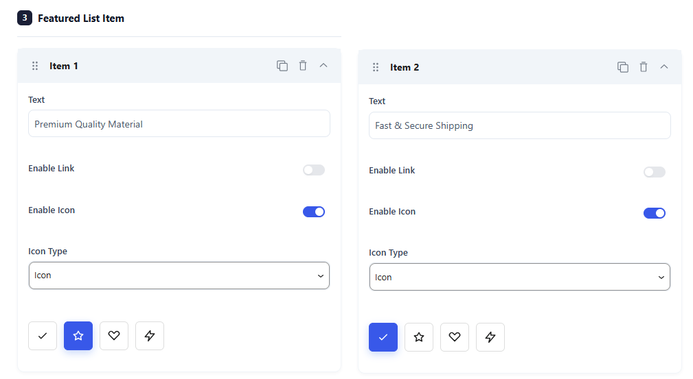
This section allows you to add individual feature highlights (like selling points, guarantees, or badges) to your product layout. You can customize the text, icons, and links for each item.
Item Configurations
Each item box contains the following options:
Text: Type the custom text or highlight you want to display (e.g., Premium Quality Material or Fast & Secure Shipping).
Enable Link: Switch this toggle on to make the item clickable and link it to a specific URL.
Enable Icon: Turn this switch on to display a visual icon next to your text snippet.
Icon Type: Pick how you want to add your graphic (e.g., select Icon to use built-in system symbols).
Icon Selector: Click on your preferred symbol from the quick-selection grid (such as a checkmark, star, heart, or lightning bolt) to set it.
4. Use Shortcode
This section gives you the freedom to place your custom list anywhere on your website.
Shortcode Toggle: Turn this switch on to generate a unique snippet of code.
Placement: Copy and paste the generated shortcode into any post, page, widget, or page builder area.
Display Page
Product List Display Page Settings
The Display Page tab controls exactly where your custom featured list shows up on your single product pages.
1. Placement Settings
This section determines the visual position and ordering of your list.
Placement on product page: Select where to insert the list from the dropdown menu.
Priority: Enter a custom ordering number (e.g., 10). Lower numbers display first if multiple items use the same placement area.
Design
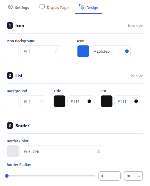
The Design tab gives you full control over the colors, layout styling, and spacing of your product list to match your store’s branding.
1. Icon Styling
Customize the color scheme of the badges or icons displayed next to your items.
Icon Background: Choose a background color for the icon’s bounding area or circle using the color picker or hex code.
Icon: Select the color for the icon graphic itself to ensure it stands out clearly.
2. List Styling
Fine-tune the typography and block layout colors for the list container.
Background: Pick a background color for the entire main container of your list.
Title: Set the text color for the main section headline.
List: Select the text color for the individual list item descriptions.
3. Border Styling
Add structural shape and definitions around your feature showcase.
Border Color: Select a specific tone or subtle shade for the bounding box outlines.
Border Radius: Drag the slider or input a number to round out the corners of your container box. You can change the units using the unit selector dropdown.
Backend Preview
The plugin offers 5 beautifully pre-designed templates to help you quickly change the style of your Product List. You can switch between these looks with a single click to find the one that best matches your store theme.
Crystal Template: A clean, minimalist layout with transparent item blocks, a subtle border, and standard colored icons.
Midnight Template: A bold look featuring a deep, dark block background with white text and vibrant contrasting icons.
Zen Template: A modern style featuring pure text layout with borderless list spacing and matching minimal icons.
Aurora Template: A sleek style that puts each feature into its own individual pill-shaped dark button container.
Fusion Template: An eye-catching option featuring a vivid gradient background with rounded sub-cards for maximum visibility.
Frontend Preview
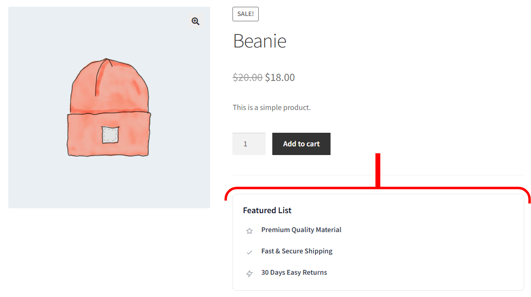
This is how the Featured List block looks to your customers on the front-end product page. It neatly organizes your key selling points right below your purchasing options to increase buyer confidence.
Header Title: Displays your custom label (e.g., Featured List) to introduce the information segment.
Visual Highlights: Renders each customized bullet point line-by-line with its selected icon.
Strategic Placement: Integrates smoothly into the product page section you chose under your display settings
Watch the documentation walkthrough below
Quick Social Link
This helps you add social media links to the product page through which users can directly share the product or page. Let’s see how you can enable it.
Open the Store One dashboard.
This will be shown when you click on Configure.
First thing you need to do is enable the module. Its preview is given on the right side, so you can see the changes live.
Then there is a Rule that you can set to active or inactive. You can create multiple rules and add social media to them. For example, you can create a rule for social media links for all products, and another rule for social media links for all pages. So the rules will be applied, and the social media buttons will appear as per the rules.
Then, in the Trigger Type, you can set where you want to apply the Rule.
Next, you can add the social media icons that you want. When you add a social media icon, its settings appear. First, you will see the platform tabs like social, messaging, business, etc. You can select the platform, and then you can upload an image icon or a custom SVG, if not want the default icon.
After setting up the module, you can see the final preview.
Watch the documentation walkthrough below
Badge Management
This lets you create badges that simplify your store. Add badges like Sales, Discounted, etc.
Open the Store One dashboard and click on the Badge Management module.
This will open its settings.
First, enable it from the button above. From the Show Badges, you can select which products you want to show the badges.
The buttons below Show Badges set where to show the badge and where not. As Loop and Single Pages are enabled, the badges will be shown on these pages. But if you enable the Exclude button, you can select products that you want to exclude from displaying a badge.
Next, switch tab to User Condition
Select the User Condition means the users you want to display the badges to. If you want to exclude some users from seeing the badges, enable the Exclude button and select the roles and users.
Next to customize the Badge appearance, switch to
From the Badge Type, select what you want to display as a badge; there are several options, including text, image, CSS, etc.
Then you can change the appearance by style, margin, border, etc.
After all, your badge will display like this.
Product Video Gallery
Videos can describe a product much more effectively than an image. Using this module, you can put a video on the product page and an image on the shop page.
Let’s understand the procedure step by step.
The first thing we need to do is to add a video to a product. Click on Add Video
You will be redirected to the All Products page, click on the product you want to add video to.
Scroll down to Store one section.
Two buttons are here to add video as Featured video and Video gallery.
If you enable Featured Video, the video will be added to appear on the shop page, replacing the product image. I will show you the result after setting it up. And the Video Gallery will be displayed on the single product page.
After this, you can save changes by publishing the product. Return to the Product Gallery module dashboard.
From this page, you can set a global thumbnail that will be shown in all product pages if not given in the product’s meta. If a thumbnail is set in meta, as we set, then it will overwrite the Global image.
Again, this ratio of the video is global on all product pages. You can enable Auto Play, which will enable video play automatically as the product page is opened.
The thumbnail play icon and its color can be changed from the options below.
Now switch to the Featured tab.
The same options are given as in the Gallery. You can upload the global thumbnail, set its ratio, auto-play, and icon.
This is how it will look after setting up.
Bundle Product
Open your Store Dashboard and click on the Bundle Product’s Configure button.
Now follow the steps below.
Enable the Addon with the button marked with number 1, and then click on the Create Bundle button marked with number 2.
This will redirect you to Create Product Page
Give it a name and scroll down to Product Data.
Select the Product Data as Bundle Product
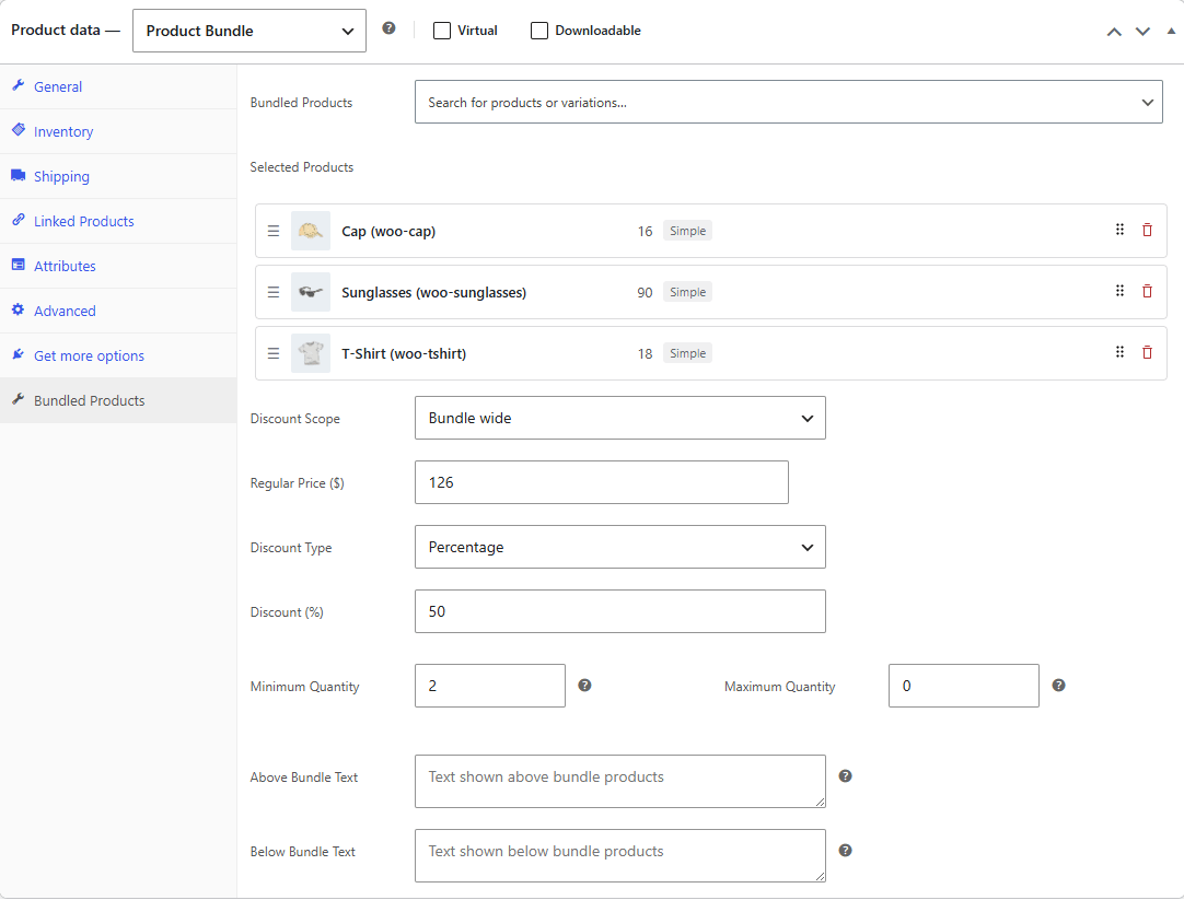
After selecting the product data as Product Bundle, its settings will open in the Product Data section.
Bundled Products: Click this search bar and start typing to find and select the individual items or product variations you want to include in this bundle.
Selected Products: View your active bundle items, where you can click and drag the three horizontal lines on the left to change their display order, or click the red trash can icon on the far right to delete them.
Discount Scope: Choose from the dropdown menu whether your pricing discounts apply to the entire bundle as a whole or to individual items within it.
Regular Price ($): Enter the standard, full retail cost of the bundled collection before any promotional markdown is calculated.
Discount Type: Select whether your promotional bundle markdown should be calculated as a fixed monetary amount or as a specific percentage off.
Discount (%): Enter the numeric value of the promotional markdown you want to automatically deduct from the regular price.
Minimum Quantity: Enter the minimum total number of bundled items a customer must buy to checkout or qualify for the price.
Maximum Quantity: Enter the highest number of bundled packages a single customer is permitted to purchase, or set it to zero for no limit.
Above Bundle Text: Type custom informational messages or instructional content that will show up directly above the itemized list on the live page.
Below Bundle Text: Type specific terms, notes, or promotional text that will display directly beneath the bundle package items.
So when you select the Bundle Wide as a Discount Scope, and then click on the six-dots icon next to the trash icon on any product, it opens these advanced settings for that specific item.
Optional: Check this box to allow customers to choose whether they want to include this specific item in their bundle.
Hide Discount: Check this box to hide the original regular price display for this specific product on the front end.
Quantity: Check this box to let customers choose their own custom quantity for this specific item inside the bundle.
Min quantity: Set the lowest number of units a customer must select for this specific item if it is included.
Max quantity: Set the highest number of units a customer is allowed to select for this specific item.
When you change the Discount Scope to Per product, the general Regular Price block locks, and the Discount Type and its options move directly into each individual item’s advanced settings panel.
Optional: Check this box to allow customers to decide if they want to include this item in their bundle.
Hide Discount: Check this box to hide the original regular price of the individual product on your store pages.
Quantity: Check this box to let customers manually choose their preferred quantity for this specific product.
Min quantity: Enter the minimum number of units a customer is required to take for this specific product.
Max quantity: Enter the maximum number of units a customer is allowed to buy for this specific product.
Discount Type: Click this dropdown to choose if this specific item gets a Percentage off or a Fixed dollar amount markdown.
Discount (%): Enter the numeric percentage or fixed value to be deducted only from this item’s specific price
After these settings, publish the product.
Come back to Store One’s Bundle Product addon.
Product Page
You can control how your bundled items look and function on the public product page using these toggle switches and dropdown options.
Display bundled product thumbnails: Toggle this switch on to show small image previews for each item included in the bundle.
Display bundled product descriptions: Toggle this switch on to show the individual text descriptions for each bundled item.
Display bundled product quantities: Toggle this switch on to show customers the exact number of units included for each item.
Make bundled product thumbnails and titles clickable: Toggle this switch on to allow customers to click on an item’s picture or name to visit its individual store page.
Display prices of bundled products: Click this dropdown to choose how item pricing is displayed. Select Price per unit to show individual costs, Total price to show the combined sum, or Hide to obscure item prices completely.
Calculate the prices of bundled products based on: Click this dropdown to decide which baseline rate to use for bundle math. Select Sale price to calculate discounts from current promotional rates, or Regular price to calculate from standard retail rates.
Where to display the bundled products: Click this dropdown to change the visual position of the bundle layout on your webpage. Select the ” Before add to cart button or the ” After add to cart button.
Product Page
You can manage how your bundled items behave and display inside the shopping cart using these toggle switches and dropdown options.
Hide bundled products in cart: Toggle this switch on to hide the individual items from the cart view so customers only see the main bundle name.
Hide bundled products in Quantity: Toggle this switch on to stop showing individual unit quantities for the separate items in the cart.
Hide bundled products in Price: Toggle this switch on to remove the separate pricing displays for each individual item inside the cart.
Include links to bundled products: Toggle this switch on to let customers click on the item names inside the cart to visit their original product pages.
Cart contents count will include: Click this dropdown to decide how the shopping cart item counter updates. Select Bundle as one product to increase the total count by one, or Bundled items separately to count every individual product inside the package.
Preview
You can see an instant visual mockup of how your bundle configurations will appear to your customers using the Preview layout section at the top of your workspace.
Product Page Tab: Click this tab to view an interactive simulation of the frontend product page, displaying how your images, checkboxes, quantities, and individual item pricing layout look on your site.
Cart Page Tab: Click this tab to switch views and check exactly how the bundled package items, unit quantities, and grouped prices display inside a standard shopping cart layout.
Website Preview
On the Shop Page, the Bundle Product appears along with other products. When the user clicks on the Bundle Product, it comes to the Single Product page.
All products that we added are appearing here. The price is 50% as the discount is set to 50%. And the quantity of the product beside the Add to cart button is 2, it can’t be reduced to 1, as we set the minimum quantity to 2.
When a customer clicks the add to cart button on the product page, the plugin instantly groups your chosen items into a single bundle package and adds them to the shopping cart. The quantities, items, and prices displayed in the cart automatically reflect the exact rules you configured in the backend add-on panel.
Watch the documentation walkthrough below
Sale Notification
This addon builds instant buyer trust by displaying recent sales activity on your storefront. Let’s explore every feature and setting so you can set it up perfectly.
From your Store One dashboard, click on the Configure button of the Sale Notification addon.
Settings
This section controls the basic settings of the addon.
Status Toggle – Slide this to active to turn on the Sale Notification addon.
Rule Name – Give your current rule a title (e.g., Rule 1 Notification). This helps you organize different notifications if you create multiple rules.
Number of Products to Show in Notification – This sets the maximum number of items that will cycle through your alerts. A lower number repeats the same popular products, while a higher number showcases a wider variety of your store’s inventory.
Show Order from list – This tells the system how far back in time to look for completed sales. For example, setting this to “7” means only items bought in the last week will pop up, keeping your social proof fresh and relevant.
Order Status – This filters which orders qualify for a notification based on their current progress stage (e.g., Completed, Processing, Pending). Selecting “Completed” ensures alerts only appear for finalized sales, preventing unverified or cancelled orders from showing up.
Select Selected Products / Search products to list – A search and selection field to manually pick specific items you want to promote. This restricts the addon to only show sales alerts for the specific items you chose, which is perfect for pushing high-margin products.
Exclude products – A search and selection field to choose items that should never be turned into alerts. Hidden, private, or out-of-stock products will be completely blocked from ever appearing in a pop-up.
The moment you change the Data Source to Fake Order, its settings open
Data Source – A dropdown menu to choose where your notification data comes from. Selecting Fake Order shifts the addon from reading live store database entries to using your manually entered placeholder information. Fake Orders List – An expandable, reorderable list showing all your custom-created notification items (e.g., Fake 1). You can drag to reorder, duplicate, or delete entries using the top-right icons on each card. Customer Name – A text field to input a simulated shopper name. The name typed here replaces the user tag in your main display template. Customer Address – A text field to input a simulated location. You can enter specific cities or regions to tailor the notifications to your target market. Time to Sold – A text field to enter the time phrasing for the purchase. Entering phrases like “1 Week ago” or “2 hours ago” adds immediate urgency to the front-end alert. Product Source – A dropdown selection menu determining where the linked product details come from. Setting this to Store Product pulls actual items directly from your live inventory catalog. You can change it to Custom Product and create a product to show. Select Product – A product selection queue displaying currently attached inventory items. It shows live database info like stock status and specific product IDs. An autocomplete entry bar that allows you to quickly look up items in your inventory and link them to the fake order card. Add Fake Order – A button link located at the bottom of the form that generates a blank new order template box so you can add multiple alerts to your rotation loop.
Notification
This section controls the wording, timing behavior, and positioning of the pop-up boxes on your website.
Display Notification Content (Text) – This is the template editor for your main message text, supporting placeholder tags like {name}, {city}, and {product_name}. It automatically turns raw order data into a friendly, readable sentence like “Amit from Bangalore purchasedNokia 1100″.
Display Notification Text (Subtext) – This field allows you to set the format of the notification.
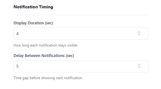
Display Duration (sec) – The number of seconds an individual pop-up stays visible on screen before hiding. Setting this to “5” means the buyer alert stays up long enough to read comfortably, then automatically slides away. Delay Between Notifications (sec) – The gap of silence or waiting time between one notification disappearing and the next one sliding in. This prevents your website from feeling spammy by giving visitors a break between consecutive pop-up alerts.
Notification Position – A dropdown menu to choose exactly where the alert card attaches to the browser screen (e.g., Bottom Left, Bottom Right, Top Left, and Top Right). This lets you position the alert so it does not block important site elements like mobile chat widgets or navigation buttons.
Initial Delay – A timing option that randomizes the first appearance time within a set range. This makes the notification behavior feel more organic and human, rather than looking like a rigid, robotic script.
Random Delay – A setting that adds a randomized timing variance between subsequent notifications. Pop-ups appear at irregular intervals (e.g., 4 seconds then 8 seconds), mimicking real, live-time store activity.
Notification Animation – You get various animation options that take place when notification appears. You can select any one animation and notification will follow the same animation on website.
Loop Notifications – A simple toggle switch to turn continuous playlist looping on or off. Turning this on means once all recent sales are shown, the addon cycles back to the first one, ensuring your screen never stays completely empty.
Visibility
This section determines exactly who sees your notifications, which pages they appear on, and what devices can display them.
Trigger Type – A filter layout determining which URL spaces display the notifications.
All Pages: Displays the sales pop-ups across every single page of your entire site.
Specific Products: Limits the notification display exclusively to chosen product pages.
Specific Categories: Restricts the pop-ups to show only when customers are browsing specific collections.
Exclude products – A specific page suppression list tool that completely blocks notifications from rendering on the designated pages you select here.
Search – A quick Finder entry bar within the visibility sub-menus. It allows you to quickly type and find products or categories to apply your visibility rules to without scrolling endlessly.
Device Visibility (Desktop / Tablet / Mobile Toggles) – Three independent toggle options to activate or deactivate the addon across different device screens. You can turn off “Mobile” to keep compact smartphone screens clean and uncluttered, while keeping notifications fully functional for desktop shoppers.
Style
Design Presets allow store owners to instantly transform notification card layouts with various options that help recalibrating typography, structure, and padding. This functionality ensures pop-up alerts align with a store’s theme, promoting customer trust without requiring manual adjustments.
Rule Actions
Users can establish multiple distinct notification rules with customized settings to tailor pop-up behaviors for specific website pages. This functionality enables running varied, concurrent rules, such as displaying live order notifications on all pages while featuring curated lists on specific category.
Backend Preview
This area allows you to choose the layout and overall vibe of the notification card. Use the tab buttons to switch between them
You get 4 layouts that you can switch. All are customizable.
Website Preview
This is what we just designed.
Watch the documentation walkthrough below.
Trust Badges
This addon builds immediate shopper confidence by displaying secure payment icons, brand logos, or guarantee badges across your product pages.
From your dashboard, toggle the master Enabled switch at the top to activate the addon. You can manage multiple badge configurations by setting up individual custom rules.
Settings
This section controls which products display the trust badges, how the items are grouped, and the source of the badge imagery.
Rule Name – Give your current rule a descriptive title (e.g., Rule 1: Payment options) to stay organized when using multiple badge setups.
Status – A dropdown menu to instantly turn the current rule Active or Inactive.
Title – A text field to enter a public heading displayed above your group of badges (e.g., Payment options).
Trigger Type – A dropdown menu determining exactly where this rule applies:
All Products: Displays the badges site-wide on every single item page.
Specific Products: Displays badges only on chosen inventory items.
Specific Categories: Restricts the icons to specific catalog collections.
Specific Tags: Restricts the icons to products matching specific tags.
Disable: Temporarily turns off page targeting for this specific rule.
Exclude products – A search and selection field to hide badges from appearing on specific items.
Exclude categories – A search and selection field to block badges on entire chosen categories.
Exclude product tags – A search and selection field to prevent badge visibility on specific tagged items.
Exclude On Sale products – A toggle switch to completely hide badges from items that currently have sale pricing applied.
Brand Item – An expandable, reorderable list of your current badges (e.g., Brand 1, Brand 2). Use the drag handles to reorder, or click the icons to duplicate or delete specific badge slots.
Choose Badges – A dropdown menu giving you two ways to select your icons:
Preset: Select standard, pre-built payment and trust logos from an integrated library dropdown menu.
Custom: Unlocks an Upload Image zone supporting PNG, JPG, and SVG file formats so you can use your own unique graphics.
Enable Link – A toggle switch that transforms the badge graphic into a clickable hyperlink, letting you redirect users to security verification pages or brand details.
Add List Item – A button link located at the bottom of the list to instantly append a new, blank badge slot to your current rule.
Duplicate – You can duplicate the brand item using the icon on the left side of the Delete icon. After duplicating, you can make changes to that item.
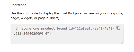
Shortcode – Generates a snippet code copy container. You can paste this snippet anywhere on your website, including blog posts, pages, sidebars, or page builders, to display this specific badge group outside of standard product templates.
Display Pages
This section dictates the functional behavior of the badge carousel and pinpoints its exact positioning on your product layouts.
Display Trust in Slider – A toggle switch that automatically organizes your trust graphics into a horizontal, swipable carousel layout.
Slides to Show – A numerical selector setting the maximum number of badges visible at one time before scrolling.
Auto Play – A toggle switch that automatically slides the badge carousel across the screen without requiring manual user interaction.
Show Navigation – A toggle switch that overlays navigational arrow buttons on the slider layout for easier manual browsing.
Placement on product page – A dropdown alignment engine that selects the precise hook zone where your badges sit on your layout structure:
After Add to Cart Form
Before Product Summary
Before Add to Cart Form
Before Add to Cart Button
After Add to Cart Button
Before Product Meta
After Product Meta
After Product Summary
Priority – A numerical box allowing fine-tuned placement adjustments. Lower numbers pull the badges higher within their designated hook zone, while higher numbers push them lower relative to surrounding page elements.
Design
The Design Tab enables customization of trust badge layout and visuals to align with website branding, featuring controls for margin spacing, image scaling, and horizontal gaps.
Key settings include the Enable Black/White Images toggle, color pickers for background and text, and comprehensive border controls for styling.
Backend Preview
Its real-time preview panel allows administrators to instantly visualize style adjustments, layout modifications, and animations before saving. This interface supports live layout synchronization.
Frontend Preview
After all, save the changes. You can see the result below.
You can also watch the video walkthrough.
Sale Countdown
This addon adds urgency and boosts sales by displaying live countdown timers for your sales, discounts, and limited-time offers on your store.
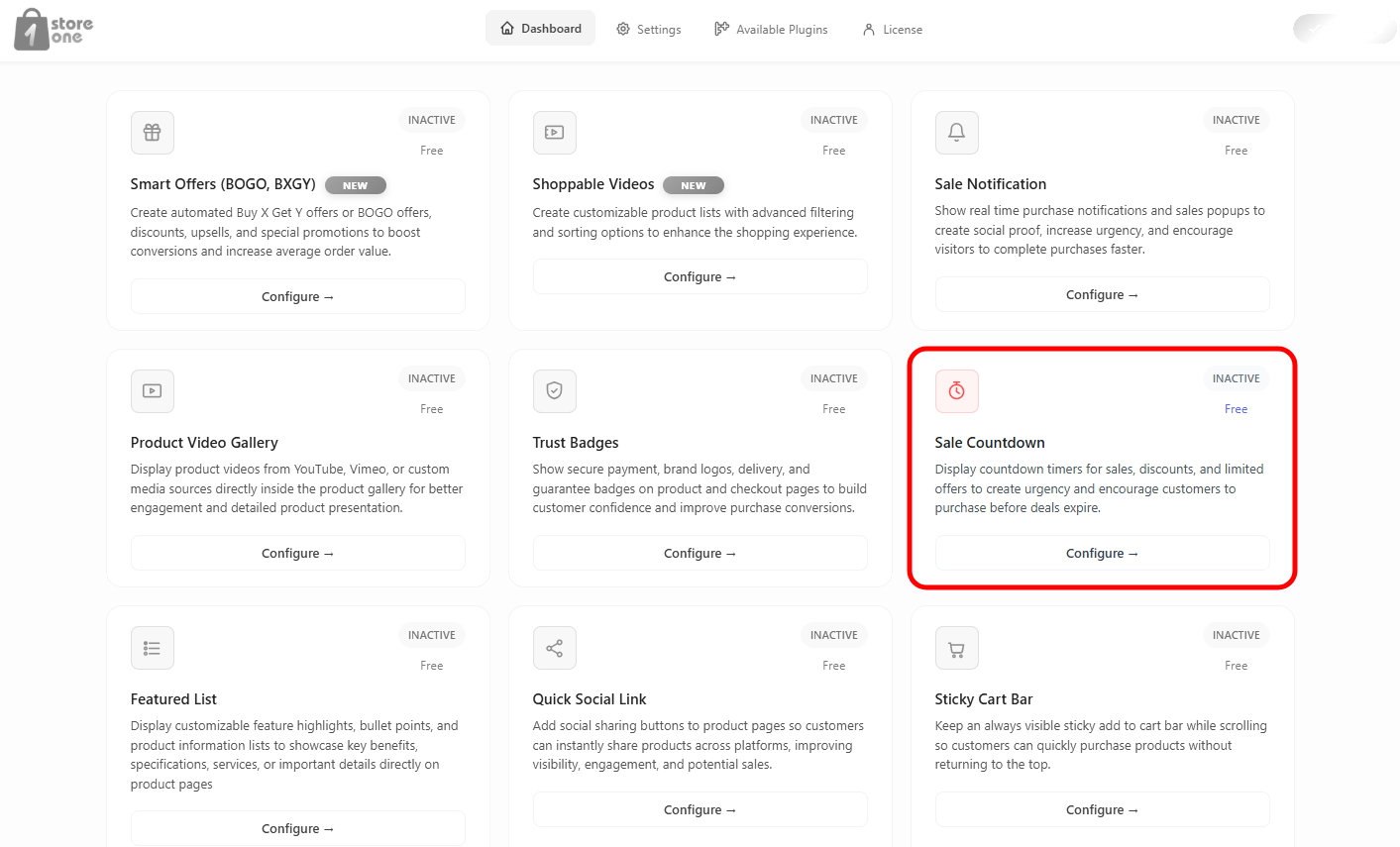
Open the Storefront dashboard, and click on the Sale Countdown addon’s Configure button.
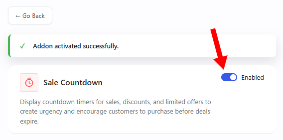
From your dashboard, toggle the switch at the top to activate the addon.
Settings
This section controls the timing configuration, custom messages, and specific page placements for your countdown timers.
Set Countdown – Choose the exact duration window for your promotional counter.
Start Date & Time: Click the calendar field to set the exact moment your sale begins.
End Date & Time: Click the calendar field to set the exact moment your promotion expires and the clock hits zero.
Sale Message – Enter a custom call-to-action text string (e.g., Hurry! Offer ends soon). This message displays alongside the ticking countdown clock.
Single Page Settings – Controls timer visibility on individual product detail pages.
Enable on Single Page: A toggle switch to turn the timer banner on or off for single item layouts.
Placement on product page: A dropdown menu to select the precise layout hook zone (e.g., Before Add to Cart Form).
Priority: A numerical box to fine-tune layout stacking order. Lower numbers pull the timer higher within its placement zone.
Enable on Archive Page: A toggle switch to turn the small timer element on or off across shop loop listings.
Archive Position: A dropdown menu to position the compact timer relative to the product grid items (e.g., After Price).
Action & Behavior
This section dictates how the addon responds to the exact moment your promotional timer expires.
Countdown Expire Action – A dropdown selection menu to choose the final automated cleanup system:
Hide Countdown: Automatically removes the entire countdown element from the screen when time runs out.
Show Message: Replaces the ticking clock layout with an expiration notification message text block.
Expire Message – A custom text field that activates when using the “Show Message” action. Type the phrase you want users to see after the sale ends (e.g., Offer expired!).
Hide / Show Countdown Message – A simple toggle switch to show or hide your main promotional header text.
Hide / Show Countdown Bar – A toggle switch to display or hide the visual progress bar element next to the clock numbers.
Style
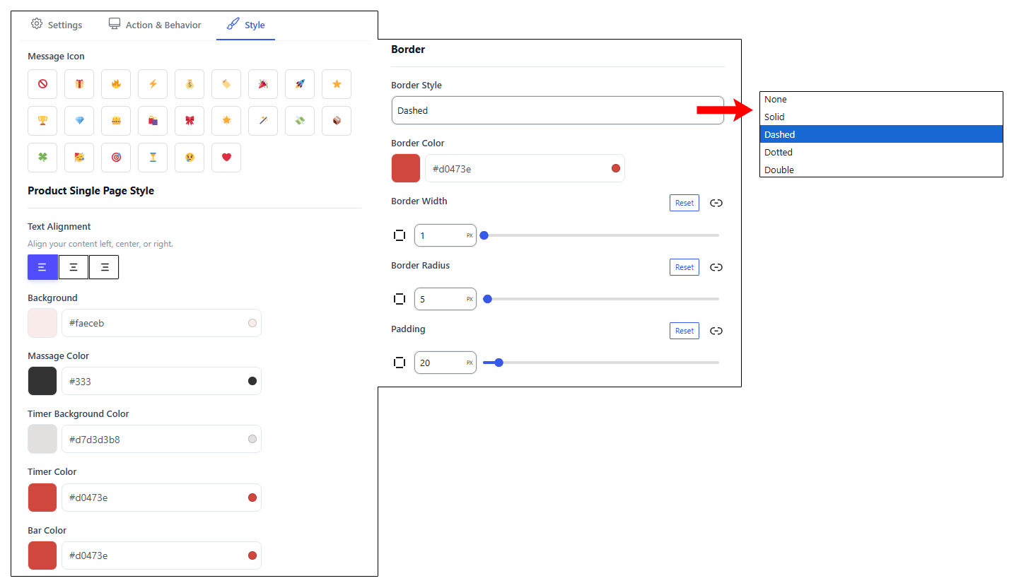
The Style Tab lets you fully customize your countdown bar’s appearance without coding. You can easily tweak icons, alignment, colors, borders, and padding to match your brand. The standout feature is the Independent Timer & Bar Customizers, which apply high-contrast colors directly to the ticking clock to maximize visual urgency.
Backend Preview
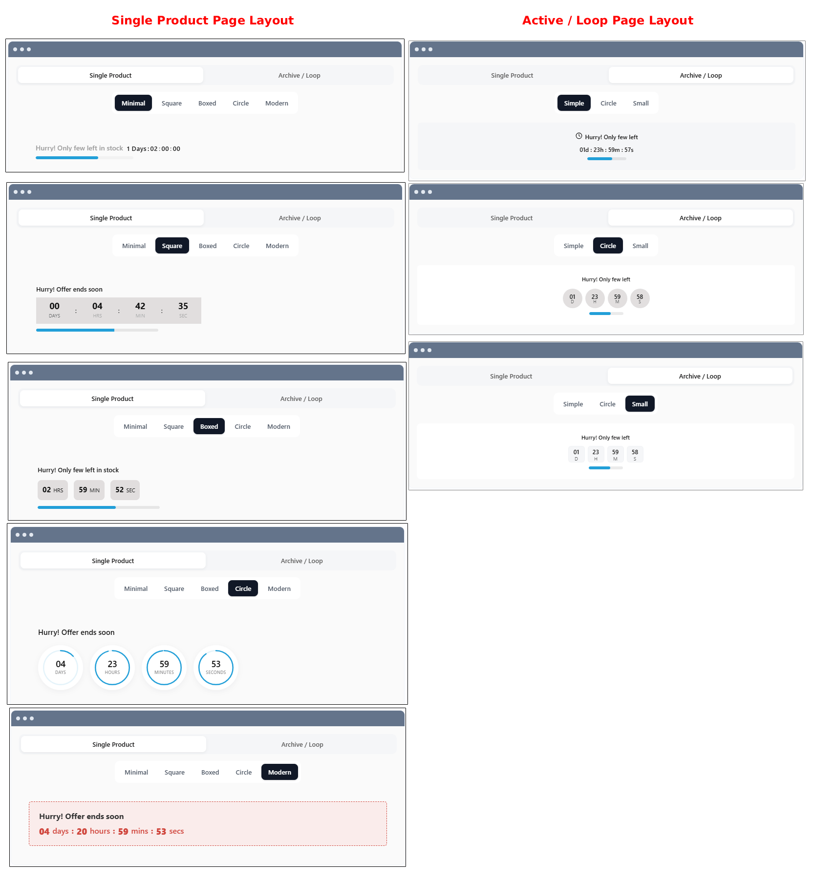
Page Layout ConfigurationsThe Sale Countdown addon provides specialized, independent display options for different sections of your store. This ensures the urgency alerts look balanced whether a customer is browsing your main catalog or viewing an individual item.
For both the Single product page and the loop / Active page, the addon activates a prominent promotional display designed to drive immediate conversions right when a shopper is evaluating a product. This configuration displays bold calls-to-action alongside active time counters placed precisely near your purchase buttons.
This dual-page integration keeps your store’s promotional consistency perfectly uniform without ever cluttering your catalog layouts or distracting from the product imagery.
Frontend Preview
Shop Page
The countdown addon injects live urgency indicators directly into your shop catalog, appearing seamlessly beneath product pricing. This front-end display features your ticking clock, custom message, and progress bar, mirroring your back-end configuration choices exactly to ensure your selected text, colors, and layout presets render identically on the live grid.
Single Product Page
The sale countdown is appearing seamlessly beneath the variable product description with the same style we saved.
You can also watch the video walkthrough.
Sticky Cart Bar
The Sticky Cart Bar addon keeps purchase options permanently visible as customers scroll down your product pages, encouraging quicker checkouts.
Open the Store One dashboard and click on the Sticky Cart Bar addon’s Configure button.
Activate the addon by toggling the switch at the top.
Settings
This section handles the placement, layout elements, and content options for your floating cart container.
Position – A dropdown menu to attach the floating bar to either the Top Bar or Bottom Bar of the browser window.
Show After Scroll (%) – Sets how far down the page a visitor must scroll (e.g., 10%, 20%, and 50%) before the sticky bar reveals itself.
Animation – Select a transition entrance effect (e.g., Slide, Fade, Bounce) for when the bar appears on screen.
Show Product Image – Toggle switches to show or hide the item’s main thumbnail inside the bar.
Show Price – Toggle switches to show or hide the item’s price inside the bar.
Enable Quantity Selector – Toggles to include quantity increment inputs and drop-down attribute selectors directly inside the floating bar.
Enable Variations – Toggles to include drop-down attribute selectors directly inside the floating bar.
Button Action – Selects whether clicking the action button instantly adds the item to the Cart or redirects the buyer straight to the Checkout page.
Button Text – A text field to write custom button labels (e.g., Buy Now).
Offer Banner – A toggle switch that expands a secondary promotion line. It includes fields for a custom Message (e.g., Special Offer ends soon), an active Timer, and a specific Start / End Date & Time picker to run time-sensitive cart deals.
Visibility
This section determines exactly where on your site the sticky bar displays, with specific mobile optimization rules.
Trigger Type – A dropdown to apply the bar to All Products, Specific Products, or entire Specific Categories.
Exclude products – A search bar to blacklist specific item sheets from ever rendering the sticky bar.
Device Visibility – Dedicated layout toggles to activate or deactivate the bar for Desktop, Tablet, or Mobile screens.
Mobile Settings – A standalone optimization panel that lets you override standard styles on mobile devices. You can independently show or hide the product image, price, quantity selector, and variation choices specifically for smartphone viewports to save screen space.
User
This section manages user-level access filters to target specific customer groups.
User Condition – A dropdown menu allowing you to show the sticky bar to All Users, only Selected Users, or only Selected Roles visitors.
Exclude Roles – A search filter to hide the sticky bar from specific website user account levels (e.g., Administrator, Subscriber).
Exclude Users – A manual selection tool to block specific individual customer accounts from seeing the bar.
Style
The Style Tab enables full visual customization of the floating container, featuring color pickers for the bar background, text, prices, and variation labels. Users can independently configure the button’s colors to ensure the call-to-action stands out.
After configuring your sticky bar choices, click Save Changes to push them live to your store.
Backend Preview
The Sticky Cart Bar back-end interface features a real-time responsive preview panel that lets you instantly test style and positioning choices. This control area provides three dedicated view tabs, Desktop, Tablet, and Mobile, allowing you to verify exactly how the floating bar, product images, price tags, and custom buttons scale across different screens before saving your live storefront layout.
Frontend Preview
When a user lands on a product page where the addon is fully active, the Sticky Cart Bar anchors itself to the bottom of the screen. If you have added a specific item to your back-end exclusion list, the addon remains completely hidden on that product page, ensuring it never disrupts restricted layouts.
For all active products, the system streamlines the path to purchase. The moment a customer clicks the customized Buy Now button inside the floating container, the addon bypasses the standard shopping cart loop and automatically redirects the user straight to the live Checkout page. This direct routing ensures a faster, friction-free checkout experience that immediately presents the buyer with contact info, billing addresses, and order summary fields to finalize their purchase.
You can also watch the video walkthrough.
Buy Now Button
The Buy Now Button addon speeds up purchasing by adding a direct purchase button that you can set up to skip the standard cart step and send customers straight to checkout.
Open the Store One dashboard and click on the Buy Now Button addon’s Configure.
Activate the addon by toggling the switch at the top right of the dashboard.
Settings
This section controls where the button displays, the button text, and which products qualify to show it. The panel is split into independent controls for catalog grid layouts and individual item sheets.
Archive Page
Enable on Archive Page – A toggle switch to display the direct button on your shop loop and category grid pages.
Archive Position – A dropdown menu determining where the button sits relative to other catalog elements (e.g., after add to cart).
Button Text – A text field to write custom labels for the archive button (e.g., Buy Now or Checkout).
Default Quantity Set – A numerical field that establishes how many units of the product are automatically added when a user clicks the button from the archive page.
Replace Add to Cart Button – A toggle switch that hides the standard “Add to Cart” button and swaps it entirely with your Buy Now button.
Trigger Type – A dropdown mapping engine to apply this archive button to specific catalog spaces:
All Products: Displays the button site-wide across all catalog listings.
Specific Products: Restricts the button to chosen inventory items.
Specific Categories: Displays the button only within selected collections.
Disable: Disables archive-level display entirely.
Exclude Products – A search bar to block specific items from ever showing the button on the archive page.
Exclude Categories – A search bar to hide the button across entire collections.
Exclude On-Sale Products – A toggle switch that automatically strips the button away from any item running a promotional discount.
Single Page
Enable on Single Page – A toggle switch to turn on the direct button on your individual product detail layouts.
Placement on Product Page – A dropdown layout engine selecting the exact structural section where the button renders (e.g., After Add to Cart Form).
Priority – A numerical entry adjusting vertical placement. Lower numbers pull the button closer to the top of its designated layout zone.
Replace Add to Cart Button – A toggle switch to overwrite the standard cart button on individual details pages.
Button Text – A text field to write a unique label specifically for single product sheets.
Trigger Type – A dropdown to apply single-page rules across All Products, Specific Products, or Specific Categories.
This section defines what happens behind the scenes the moment a user initiates a click on the direct button.
Action – A dropdown workflow menu deciding where to route the customer immediately following their click:
Redirect to Checkout Page: Routes the shopper straight to your finalized order sheet, bypassing the standard cart step entirely.
Redirect to Cart Page: Pushes the customer to the standard review cart page.
Redirect to Custom Page: Routes the traffic to a specific URL link of your choice.
Reset the Cart Before Doing Buy Now – A toggle switch that automatically clears out any existing items inside the user’s shopping cart before processing the current quick purchase.
Supported Product Types – An expandable checklist panel showing all available store catalog configurations (Simple, Variable, Grouped, External). You can toggle each type on or off independently and use the Select Product Types search box to map custom behaviors to distinct item formats.
Style
The Style Tab controls the visual appearance of your checkout button based on your selected configuration path. When the Button Style dropdown is set to Theme Style (Default), the button automatically inherits your store’s global template styling, and all manual design controls remain completely hidden.
However, switching this dropdown to Custom Style immediately opens a dedicated panel of advanced design options, unlocking color pickers for the background and text, interactive slider bars to adjust multi-side padding metrics, and a full set of border configuration fields to customize line styles, thickness, and corner roundness
Beckend Preview
The backend panel includes a responsive preview screen that splits into two active configuration view tabs:
Single Tab – Displays a live schematic mock-up of an individual item page, showing exactly how the button renders beneath core product listings.
Shop Tab – Switches to a catalog grid mock-up layout, letting you instantly verify the alignment and spacing of the archive buttons inside tight column rows.
After setting your addon, click on save.
Frontend Preview
On the Shop page, the addon injects a prominent Buy Now button directly beneath the default options, giving shoppers an instant shortcut to finalize their purchase, as shown in the screenshot below.
However, the addon dynamically adapts to your specific product rules and store settings. For an Excluded Product (Sunglasses), the button remains completely hidden to respect your restriction list. Similarly, for a Grouped Product (Logo Collection), the button automatically hides because we didn’t select the Grouped Product as Supported Product Types in Action & Behavior tab.
The front-end result of the Buy Now Button addon integrates directly into individual item sheets, such as the product details layout. On the live page, the addon successfully replaces the standard “Add to Cart” button, swapping it entirely for a prominent, custom-styled Buy Now button located right beneath the quantity selector.
When a user clicks this button, it executes your configured backend action. The system instantly bypasses the traditional shopping cart step and automatically redirects the customer straight to the Checkout page to complete their transaction with zero friction.
You can also watch the video walkthrough.
Recently Viewed
The Recently Viewed Products addon displays a curated section of items that a customer has previously browsed, helping recover sales by reminding shoppers of products they showed interest in.
Open the Store One dashboard and click on the Recently Viewed addon’s Configure button.
Enable the addon
Settings
This section controls the basic title information, structural display metrics, and sorting logic for your recently viewed items.
Title – A text field to enter the public heading shown above the product grid (e.g., Recently Viewed).
Title HTML Tag – A dropdown menu to select the semantic heading size (e.g., H1, H2, H3) to match your website’s typography structure.
Hide Title – A toggle switch to completely strip the public heading away from the frontend display.
Products – A slider tool to set the maximum total number of products allowed to cycle through this section.
Columns – A slider tool to establish how many products display side-by-side in a single grid row.
Columns Gap – A slider tool to adjust the breathing space and spacing width separating individual product cards.
Order By – A dropdown logic menu determining how the items are arranged within the section:
Last Viewed: Places the most recently browsed product first in line.
Random: Shuffles the viewed items into a randomized sequence.
Title: Arranges the products alphabetically by their official names.
Modified Date: Sorts the items based on the date they were last updated in the store catalog.
Display
This section pinpoints where the recently viewed element renders across your website layout pages.
Show on pages – Independent toggle switches to activate or deactivate the section across key areas of your store:
Product Single: Renders the section on individual product detail pages.
Cart: Displays the section on your store’s shopping cart overview layout.
Checkout: Shows the section directly on your final order checkout page.
Loading Priority – A numerical slider allowing fine-tuned placement adjustments. Lower numbers give the block higher loading priority, pulling it further up the page template layout relative to surrounding elements.
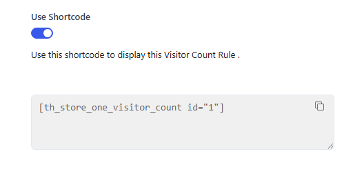
Shortcode – Generates a snippet code copy container (e.g., [th_store_one_recent_view]). You can paste this snippet anywhere on your website, such as custom pages, widgets, blog posts, or page builders, to display your recently viewed section anywhere outside standard templates.
Design
The Design Tab controls the layout structure and typographical accents of the recently viewed block.
Display in Slider – A toggle switch that transforms the standard product grid into a horizontal, swipeable carousel layout.
Slides to Show – A numerical selector that sets the maximum number of product cards visible at one time inside the slider row.
Auto Play – A toggle switch that automatically slides the product carousel across the screen without requiring manual user interaction.
Show Navigation – A toggle switch that overlays navigational arrow buttons on the slider frame for easier manual browsing.
Title Color – A color picker hex box that adjusts the typographical color of your section heading.
Backend Preview
The backend interface features a structural wireframe mock-up layout located directly next to your tab options. This preview provides an instantaneous layout glance, letting you visualize how your column amounts, column gaps, slider components, and heading tags integrate together before pushing your settings live to the store.
Frontend Preview
The front-end result of this addon displays a dedicated, horizontal product section directly on your active store pages. The layout showcases the items a customer has recently browsed, rendering them in a clean row format complete with their respective images, names, sale badges, pricing, and action buttons.
This live display reflects your backend choices, organizing the items into a carousel layout with visible navigation arrows on either side. Customers can click these arrows to scroll through their viewing history effortlessly, making it easy to find and buy items they previously considered.
You can also watch the video walkthrough.
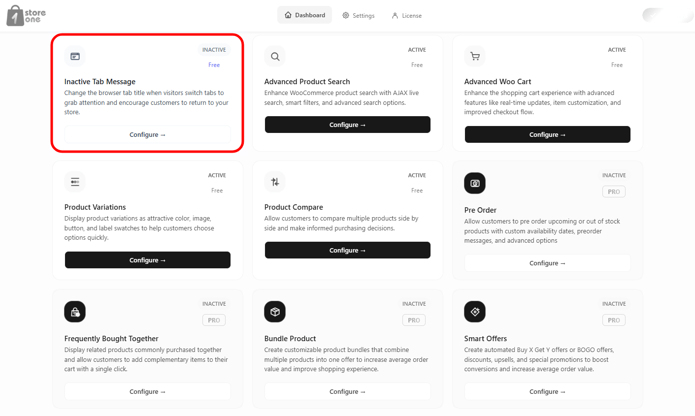
Inactive Tab Message
The Inactive Tab Rule addon engages users who switch away from your website by dynamically changing the browser tab title and favicon. This keeps your store visible even when customers are browsing other websites, encouraging them to click back and finalize their purchases.
You can instantly track your text modifications and icon layouts using the live preview screens located next to your controls.
Open your Store One dashboard and click on the Inactive Tab Message addon’s Configure button.
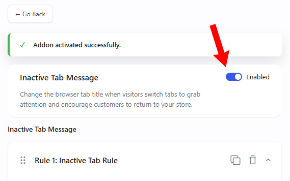
Enable the addon.
Settings
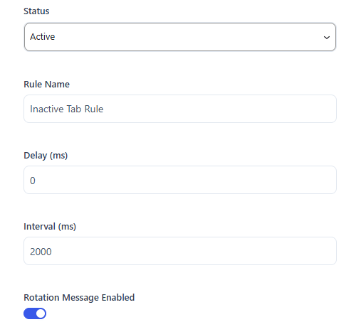
This section controls the general activation status, rule identification, and underlying display intervals for the tab notifications.
Status – A dropdown menu to instantly turn the current rule Active or Inactive.
Rule Name – A text field to input an administrative name (e.g., Inactive Tab Rule) to keep your settings panels organized.
Delay (ms) – A millisecond numerical box that sets how long the browser tab waits after a user goes inactive before starting the notification rule.
Interval (ms) – A numerical box that dictates the flash transition speed (e.g., 2000) between your active messages when a rotation is running.
Rotation Message Enabled – A toggle switch that enables cycling through multiple distinct phrases rather than displaying just a single static alert sentence.
Message
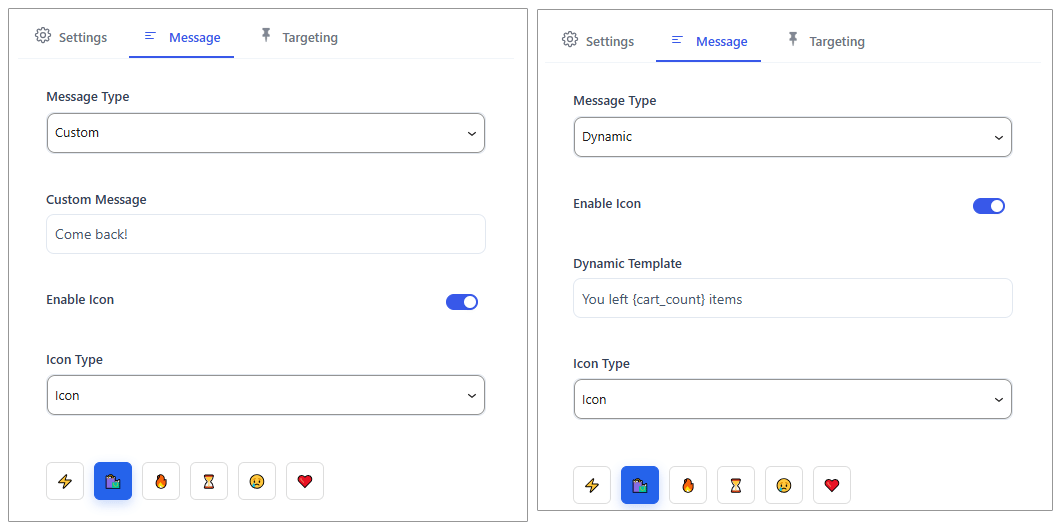
This section houses your creative text configurations, icon graphic sources, and rotation sequence setups.
Message Type – A dropdown selection menu determining your messaging framework:
Custom: Allows you to write fixed, personalized text callouts.
Dynamic: Unlocks an automated phrase template system.
Enable Icon – A toggle switch that replaces your default website tab favicon with a custom attention-grabbing graphic when the user clicks away.
Dynamic Template – A tracking editor box that generates text automatically using system counters (e.g., You left {cart_count} items).
Icon Type – A dropdown menu allowing you to choose the technical format of your custom tab favicon:
Icon: Displays simple pre-built design symbols from the interface library.
Image: Unlocks an upload zone supporting standard image assets.
SVG: Opens a code block container to insert lightweight vector graphics.
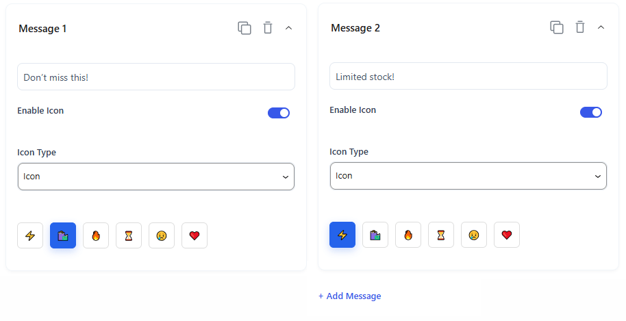
Rotation Messages – An expandable queue tracking your multi-phrase text sets (e.g., Message 1, Message 2).
Message Text Field: A text entry block to type your primary copy variants (e.g., Don’t miss this! or Limited stock!).
Icon Library Bar: A horizontal ribbon grid displaying emoji symbols (e.g., shopping bags, lightning bolts, exclamation hearts) to map directly to each text slide.
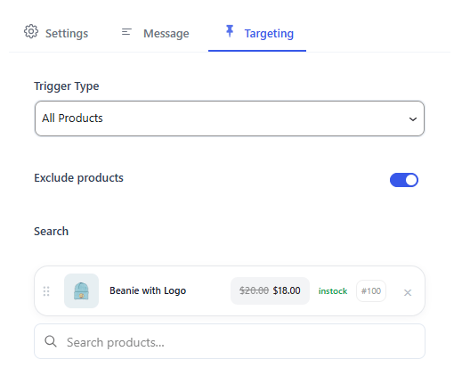
Targeting
This section restricts your tab alert rules to target precise zones or items across your storefront URL patterns.
Trigger Type – A dropdown menu deciding where this inactive behavior rule is allowed to run:
All Pages: Runs the rule site-wide across every single link.
Specific Pages: Limits the tab flashing to customized site pages.
All Products: Activates the rule only when users leave item overview tabs.
Specific Products: Restricts the rule to chosen inventory items.
Home Page Only: Limits the tab flashing exclusively to your core landing index.
All Single: Targets all independent detail page types globally.
Exclude products – A specific product entry row that acts as a blacklisted shield, completely blocking the inactive rule on those specific product links.
Search – A real-time autocomplete entry bar layout that lists your active inventory catalog items to quickly choose them for targeting or exclusion
Backend Preview
The backend interface features a live browser preview layout showing multiple simulated tab instances. This area updates in real time to mimic actual browser behavior, rendering your typed text phrases alongside your assigned emoji graphics exactly as they will look inside the user’s browser bar.
Frontend Preview
The front-end result of this addon alters the browser tab layout dynamically the moment a customer switches to another window or section. Instead of remaining static, the browser tab updates to showcase your custom promotional text alongside an attention-grabbing custom icon.
As shown in the active browser view, when a user leaves the product sheet to view another tab, the browser bar instantly flashes your chosen phrase. This continuous visual reminder stands out among crowded browser headers, enticing distracted visitors to click back and complete their purchases.
You can also watch the video walkthrough.
Frequently Bought Together
The Frequently Bought Together addon increases your average order value by encouraging customers to buy complementary products as a bundle. It displays beautifully matched items right on the product page with a single-click “Add All to Cart” button. You can instantly track your style and layout changes using the live preview screens located next to your control tabs.
Open the Store One dashboard and click on the Frequently Bought Together addon’s Configure button.
Enable the button.
Click on Add New Rule.
You can create multiple rules with different conditions.
Settings
This section controls which products display bundles, what offers are called, and which items are hidden from promotions.
Status – A dropdown menu to instantly turn the current rule Active or Inactive.
Offer Name – An administrative text field to label your offer to keep your dashboard organized.
Search Offer products – An autocomplete search bar that lets you manually choose which items are grouped together into the bundle.
Trigger Type – A dropdown menu determining exactly where this bundle rule applies:
All Products: Displays this specific bundle site-wide on every single item page.
Specific Products: Displays the bundle only on chosen inventory items.
Specific Categories: Restricts the bundle to specific catalog collections.
Specific Tags: Restricts the bundle to items matching specific product tags.
Exclude products / Exclude categories / Exclude product tags / Exclude On-Sale products – Safety inclusion and exclusion filters to completely shield and block specific items or discounted products from displaying bundles.
User Condition
This section manages user-level access filters to target specific customer groups.
User Condition – A dropdown menu allowing you to show the bundle to All Users, only Selected Roles (e.g., editors, subscribers), or only Selected Users.
Exclude Users / Roles – A toggle switch that expands filtering options to completely block specific customer accounts or administrative roles from viewing the bundle widget
Display Page
This section dictates the functional headings, pricing text templates, and precise layout positioning on your product layouts.
Placement on product page – A dropdown alignment engine that selects the precise hook zone where your bundle sits on your layout structure (e.g., Before Product Summary).
Priority – A numerical box allowing fine-tuned placement adjustments. Lower numbers pull the bundle higher within its designated hook zone.
Bundle Title – A text field to enter the public heading displayed above your group of items (e.g., Frequently Bought Together).
Price Label – The text string displayed next to the combined bundle price (e.g., Bundle Total:).
Price label for user selected product – Custom text settings to alter pricing descriptors when a buyer dynamically adds or removes individual items from the bundle queue.
Button Text – A text field to write custom call-to-action button labels (e.g., Add All to cart).
Design
The Design Tab provides visual layout options to adjust the design theme properties of your notification components, including color selections and background fills. When the theme choice dropdown is set to custom style rules, it immediately unlocks advanced design adjustments for padding margins, item alignment metrics, and border outlines.
Backend Preview
The backend interface features three interactive tab templates that allow you to instantly switch the visual arrangement of your bundle layout:
Design 1 (Grid Blocks) – Displays products in a prominent, horizontal grid row with giant plus (+) signs connecting them, paired alongside an elegant, standalone pricing and checkout summary box.
Design 2 (Equation) – Arranges products side-by-side with small check boxes directly bel226ow them, coupled with a simplified vertical pricing rundown line.
Design 3 (List) – Places products in a clean, vertical listing layout with checkmark selections directly on the product thumbnail, summarizing total calculations cleanly at the very bottom edge.
Frontend Preview
On the live page, the bundle widget renders exactly within its assigned placement zone.
The addon automatically pulls your chosen offer products and presents them in a clean, multi-column row layout alongside the main item. The layout automatically calculates the multi-item price matching, displaying your custom “Bundle Total” line right next to a high-visibility, full-width Add All to Cart action button to drive immediate, single-click bundle checkouts.
When the user clicks on the Add to Cart button, all products of the addon are added to the cart.
Watch the video walkthrough.
Stock Scarcity
Open the Store One dashboard and click on the Stock Scarcity addon’s Configure button.
Enable the addon.
Settings
This section controls the base stock count logic, fake purchase counters, and background source tracking.
Rule Name – An administrative text field to label your rule (e.g., Rule 1: Stock Scarcity) to keep your dashboard organized.
Stock Mode – A dropdown menu determining how your inventory availability data is calculated:
Default Product Stock: Reads your store’s direct database and calculates real-time live stock indicators.
Show only when quantity is below – A numerical entry box that hides the scarcity widget unless your inventory drops beneath a certain threshold limit (e.g., 10).
Dummy Stock: Disconnects from real numbers and unlocks manual sliders to generate an automated scarcity simulation effect.
Min Stock / Max Stock Sliders – Available under Dummy Stock, these sliders set the baseline boundary coordinates for your simulation loop to randomly shift within.
Stock Sold Counter – A toggle switch that includes an extra message tracking recent customer interest data alongside your inventory bars.
Source – A dropdown deciding where recent sales numbers are pulled from:
Order Product Sold Count: Calculates the total items shipped using actual transaction records.
Dummy Sold Count: Generates organic-looking fake purchases to simulate product velocity.
Min Sold / Max Sold Sliders – Adjusts the low and high boundaries for your simulated purchase counts.
Display
This section houses your custom notification templates, progress tracking bars, and site placement structures.
Dynamic Messages – Text string templates supporting smart tag overrides (e.g., {stock_quantity}, {sold_count}) to print custom alerts like “Limited stock available, just {stock_quantity} left!”
Low Stock / High Stock Thresholds – Numerical sliders that segment your inventory state into alert tiers, automatically shifting your front-end phrases as numbers drop.
Progress Bar Background Progress – A slider metric setting the default percentage fill layout for your visual bar.
Single Product Page Placement – A toggle to activate the element on detailed layouts, with a dropdown to choose the exact placement zone (e.g., After Add to Cart Form) and priority settings.
Archive or Shop Page Placement – A toggle to display micro-indicators right inside shop grid columns, with options to adjust the alignment hook (e.g., after add to cart)
Visibility
This section determines exactly where across your website layout pages the scarcity indicators are allowed to render.
Trigger Type – A dropdown menu to apply the rule site-wide across All Products, or restrict it to Specific Products or Specific Categories.
Exclude products – A specific product entry search bar that acts as a blacklisted shield, completely blocking scarcity banners on restricted sheets.
Style
The Style Tab provides visual layout options to adjust the design theme properties of your progress components. It features dedicated color pickers to independently adjust the Bar Filled accent color and the Bar Empty background track, along with specialized color swatches to coordinate your main message typography, highlight tags, and font sizing parameters.
A distinctive feature at the bottom of this panel is the Stock Status Effects framework, which includes color-coded thresholds (Low Stock, Medium Stock, High Stock) that dynamically shift the color scheme of the front-end elements automatically as inventory drops to create an immediate visual alert for buyers.
Backend Preview
The backend interface features a live browser preview layout displaying a simulated progress banner. This area updates in real time to match actual dashboard adjustments, rendering your typed dynamic template phrases alongside a filled color progress track exactly as it will look inside the live storefront page.
Frontend Preview
On the live page , you can spot the Stock Scarcity addon.
Urgency Text Alert – Displays a custom-colored marketing notification line that explicitly states the scarcity of the item, reading exactly as configured in your admin panel (e.g., “Almost sold out! Only 4 left”).
Visual Progress Bar – Generates a dual-toned horizontal container directly beneath your custom phrase. The active portion fills with your chosen accent color (e.g., bright yellow) to vividly illustrate dwindling availability, leaving a neutral gray background line to mark the remaining total stock limit.
Pre Order
The Pre-Order addon allows customers to purchase upcoming items or out-of-stock inventory in advance. This setup guide breaks down the configuration process into three clear steps, matching the backend interface layout.
Open your Store One dashboard and click on the Pre Order addon’s Configure button.
Enable the addon and click on Add Pre Order.
It will open the product list, and click on the product you want to add the pre-order to.
On the product’s page, scroll down to the Store One Product section and click on Pre Order.
This section opens a dedicated options panel inside your product editor, allowing you to define precise pricing, messages, availability dates, and purchase limits for your selected item.
Manage pre-order options for this product – A simple toggle switch to activate pre-ordering rules for the individual item.
Override global rules – A toggle switch that disconnects the item from global addon settings. Turning this on unlocks manual customization controls specifically for this single product.
Set product availability date – A radio button option to manage when the item officially launches or restocks:
No date – end pre-order mode manually: Keeps the pre-order active indefinitely until you manually turn it off.
Choose a date from the calendar: Opens a calendar tool to pick a specific deadline. The item automatically reverts to a standard purchase button once that date arrives.
Pre-order price – A dropdown menu to select the pricing tier for advance bookings. You can choose to charge the standard selling price or input a custom discounted/premium rate.
Button text – A text field to write a custom call-to-action label (e.g., Pre Order Now) that replaces your default shopping cart button.
Pre-order message – A descriptive text box to type a public notice (e.g., This product is available for pre-order.). This informational sentence displays directly on the product layout sheet.
Pre-order limit – A numerical box to set the maximum allowed order volume for advance bookings. For example, entering “2” caps the maximum quantity an individual customer can reserve.
Logged in users only – A toggle switch that restricts pre-ordering capabilities. Turning this on requires visitors to log into a store account before they can place a pre-order.
Settings
This panel provides full rule management for your advance bookings. The configuration options dynamically update depending on the behavioral modes and pricing methods you select from the dropdown fields.
Pre-order Settings
Status – A dropdown menu to turn the current offer rule Active or Inactive.
Title – An administrative text field to enter an internal rule name (e.g., Pre order Rule) to stay organized.
Pre-order Mode – A behavioral selection dropdown that updates how your front-end labels communicate stock availability:
Pre Order: Configures the system for items that are currently out of stock but will be restocked later.
Coming Soon: Configures the system for brand-new upcoming item launches that have never been available before.
Badges Text – A text field to write custom ribbon text (e.g., Pre Order) that overlays onto your catalog product thumbnails.
Date Mode – A dropdown selection that changes your availability tracking setup:
No Date – End Pre-order Manually: Keeps the pre-order active indefinitely until you change it.
Calendar Date: Swaps out the basic view to display a fresh Availability Date calendar box, letting you select the exact product launch month, day, and time (mm/dd/yyyy –:–).
Auto Disable – A toggle switch that automatically shuts down the pre-order rule once your scheduled availability date arrives.
Pre-order Pricing
Pricing Method – A dropdown calculation engine that shifts your options based on how you want to bill customers:
Use Product Price: Charges the standard retail cost of the product.
Set Fixed Pre-order Price: Unlocks a field to set a completely independent fixed price block for advance reservations.
Discount by Percentage (%) / Discount by Fixed Amount: Unlocks a box to subtract a special price markdown reward for early buyers.
Increase by Percentage (%) / Increase by Fixed Amount: Unlocks a box to add a premium price markup for high-demand reservations.
Button Text – A text field to change the direct purchase label (e.g., Pre Order Now).
Enable Message – A toggle switch to show or hide a notice line on the front-end layout.
Message – A text field to type your public note (e.g., This product is available for Pre Order.).
Preorder Limit – A toggle switch and numerical input box to establish a maximum cap boundary for advance reservations. Setting it to “0” allows unlimited checkouts.
Display
This section pinpoints the exact physical location where your pre-order buttons, notices, and badges render across both individual item sheets and catalog layouts.
Single Product Page
Enable Single Page – A toggle switch to activate or deactivate the pre-order display modules on your individual product details pages.
Placement on product page – A dropdown menu to select the precise layout hook zone (e.g., After Add to Cart Form) where the pre-order details and button will insert.
Priority – A numerical entry box to fine-tune the vertical stacking hierarchy. Lower numbers pull the pre-order block higher within its designated section, while higher numbers push it lower.
Archive / Shop Page
Enable Shop Page – A toggle switch to display or hide the pre-order layout actions across your shop index, catalog feeds, and category grid loops.
Shop Position – A dropdown alignment engine to select where the pre-order button or indicator inserts relative to your catalog grid cards (e.g., After Price)
Visibility
This section determines exactly which products or categories in your store will display the pre-order options, allowing you to control rule coverage with target settings and exclusion toggles.
Trigger Type – A dropdown menu to select where your pre-order configuration applies across your store:
All Products: Activates the pre-order settings globally on every single product page across your storefront.
Specific Products: Limits the pre-order function strictly to manually selected inventory items.
Specific Categories: Restricts the rule to show only on items belonging to chosen collections.
Exclude Products – A toggle switch that expands into a product search tool, allowing you to blacklist specific items and prevent them from ever showing pre-order options.
Exclude Categories – A toggle switch that expands into a category selection field, allowing you to completely shield whole collections from the pre-order rule.
Hide Out Of Stock – A toggle switch that automatically suppresses the pre-order button on items that are completely out of stock. Turning this on prevents customers from placing advance bookings on items unless they have a designated pre-order stock allocation.
User Role
This section manages user-level access filters, allowing you to restrict pre-ordering options to specific customer groups or account tiers.
User Condition – A dropdown menu that controls who can see and use the pre-order options on your website:
All Users: Makes the pre-order buttons and messages visible to every visitor, including guests and logged-in accounts.
Selected Roles: Restricts pre-order availability exclusively to specific website membership tiers (such as Wholesaler or Subscriber).
Selected Users: Limits pre-ordering privileges down to individual, manually chosen customer accounts.
Exclude (Users / Roles) – A toggle switch that activates custom blacklist fields directly below it to restrict access.
Exclude Roles – A search and selection field that completely blocks specific account levels (such as Administrators or Shop Managers) from seeing the pre-order buttons.
Exclude Users – A manual text search bar that allows you to input specific usernames or email addresses to block individual customers from placing a pre-order.
Style
The Style Tab controls the visual appearance of your pre-order elements, dividing design settings into badges, messages, and action buttons. It features dedicated hex color pickers to independently adjust the background blocks and text typography colors for both product badges and on-screen info messages. When the Button Style dropdown is set to Theme Default, the pre-order button seamlessly inherits your website’s active template layout style. However, switching this selector to Custom Style instantly unlocks the advanced Button Style Settings menu directly below, opening advanced options to customize the background fill, text shading, internal padding boundaries, and framing outlines to match your specific branding.
Backend Preview
The admin configuration dashboard includes an interactive, multi-view preview panel. This mock-up system helps you instantly visualize your visual arrangements and template alignments before saving changes.You can switch between two dedicated preview viewports using the toggle buttons at the top of the container layout.
Frontend Preview
On the live Shop Page, the addon updates each designated item card within your catalog grid loop by injecting a clear, bordered message box directly beneath the product pricing. For standard items like the basic T-Shirt, it displays your permanent notice text stating that the product is available for pre-order, while for time-sensitive launches like the T-Shirt with Logo, it displays a precise scheduling callout showing the exact release date and time.
Immediately below this informational box, the system swaps out your standard shopping button for your custom action button, rendering it as either “Pre Order Now” or “Pre Order” for the product we added to the preorder from the dashboard, to keep your storefront layout column rows uniform.
When a customer opens an individual item layout on the Single Product Page, the addon shifts to a high-focus reservation layout. Next to the standard quantity selector block, the default shopping cart submission field is completely replaced by your high-visibility “Pre Order” action button.
Furthermore, a clean, bordered information container anchors itself directly within your chosen page placement zone to communicate clear logistical boundaries, using real-time dynamic timestamps to tell early buyers the exact calendar deadline for their advance purchase.
Watch the video walkthrough.
Visitor Count
The Visitor Counter addon displays a live or simulated count of active users currently viewing your products. This social proof creates a sense of competition and urgency, encouraging browsing shoppers to complete their purchases faster.
Open the Store One dashboard and click on the Visitor Count addon’s Configure button.
Enable the addon
Settings
This section controls your administrative rule configurations, visitor calculation methods, and real-time database refresh timings. The configuration options dynamically update depending on the tracking source you select:
Status – A dropdown menu to instantly turn the current visitor tracking rule Active or Inactive.
Rule Name – An administrative text field to label your rule (e.g., Rule 1: Visitor Counter) to stay organized.
Real Visitors: Select this option to calculate and track your store’s direct, live network traffic. Once chosen, the panel opens the Real Viewer Settings menu, which includes:
Count Guest Users: A setting to count logged-out users.
Count Logged Users: A toggle switch to include or exclude registered customers who are actively logged into their store accounts.
Ignore Bots: A toggle switch that includes automated search bots and web crawlers in the live count.
Session Timeout: This setting manages how long an inactive visitor remains counted in your real-time data calculations before being automatically removed from the live display tracker.
Refresh Rate: A numerical input box to decide how often (in seconds) the system pings the server to update the on-screen counter.
Simulated Visitors: Select this option to disconnect from live traffic data and manually simulate store popularity. Choosing this path automatically switches the panel to display the Fake Viewer Settings menu, which includes:
Minimum Viewers: A numerical slider to set the lowest possible simulated visitor number for your counter loop.
Maximum Viewers: A numerical slider to establish the upper ceiling boundary for your fake visitor calculation range.
Default Count – An interactive slider and numerical box to set the starting baseline visitor number (e.g., 8). This is the initial number a customer sees immediately when the page finishes loading, right before any automatic number updates begin.
Update Interval – A slider control to determine the update speed in seconds (e.g., 20). The addon will automatically recalculate and change the visible fake viewer number every time this chosen number of seconds passes.
Smooth Fluctuation – A toggle switch that changes the number transition style. Turning this active ensures the counter gradually climbs or drops step-by-step (e.g., moving from 8 to 9, then 10) instead of making jarring, robotic jumps.
Enable Spike Effect – A toggle switch that triggers simulated traffic surges. Turning this active on allows the counter to occasionally break out of its steady pattern and create a sudden, massive jump in viewer numbers to build heavy shopping urgency.
Spike Chance – A slider control to set the statistical probability percentage (e.g., 20%) of a surge happening. A higher percentage means traffic spikes will trigger much more frequently during number updates
Shortcode – Generates a copyable snippet code container (e.g., [th_store_one_visitor_counter id=”…”]). You can paste this snippet anywhere on your website, such as blog posts, widget sections, or custom layout elements, to display this specific viewer counter outside of standard product hooks.
Display
This section houses your custom notification templates, dynamic message thresholds, and site placement structures.
Message – A text string template supporting smart tag overrides (e.g., {count}) to print custom front-end alerts like “5 people are viewing this right now”.
Enable Icon – A toggle switch that displays an eye-catching icon directly in front of your visitor count message.
Choose Icon – An interactive selection bar that allows you to click and choose your preferred symbol layout (such as an eye icon, tracking flame, or user profile dot).
Dynamic Messages – A toggle switch that enables automated message shifting based on your traffic volume. Turning this on unlocks three tiered alert fields:
Low Viewer Message: The specific phrase shown when traffic hits your minimum threshold value.
Medium Viewer Message: The text block displayed when viewing traffic rests in a standard, mid-tier range.
High Viewer Message: A prominent notice designed to trigger intense urgency when traffic hits your maximum volume cap.
Single Product Page Placement – A toggle switch to turn the element on or off for individual item pages. It includes a dropdown to choose the exact layout zone (e.g., Before Product Summary) and a priority field to adjust vertical stacking order.
Archive / Shop Page Placement – A toggle switch to inject compact viewer micro-indicators right inside shop grid columns and collection indexes.
Visibility
This section determines exactly which products or categories in your store will display the live visitor counts.
Trigger Type – A dropdown menu to select where your visitor configuration applies across your store:
All Products: Activates the viewer tracker site-wide across every single product page.
Specific Products: Restricts the counter strictly to manually selected inventory items.
Specific Categories: Restricts the rule to show only on items belonging to chosen collections.
Exclude Products – A toggle switch that opens a search bar tool, allowing you to blacklist specific items and prevent them from ever showing viewer count metrics.
Exclude Categories – A toggle switch that enables category-level filtering. Flipping this open allows you to select whole collections or product groups that should never display a viewer counter.
Hide Out Of Stock Products – A toggle switch to handle inventory shortages. Turning this active automatically strips the counter away from items that are sold out, preventing social proof elements from rendering on unpurchasable products.
Devices – Responsive viewport buttons to control display behavior across different screens. You can independently click Desktop, Tablet, or Mobile to activate or deactivate the counter layout for specific device breakpoints, keeping mobile screens clean and uncluttered
Style
The Style Tab controls the appearance of your visitor alerts based on your selected configuration path. When the Style dropdown is set to theme defaults, the notification box seamlessly inherits your store’s global template styling.
However, switching this selector to custom rules immediately opens a dedicated panel of advanced design options, unlocking color pickers for the background block, borders, text typography, and separate text foreground accent fills.
It also provides an option to customize the icon color alongside interactive slider bars to fine-tune font sizing, corner roundness, vertical padding, and horizontal boundary spaces.
Backend Preview
The admin configuration dashboard includes an interactive preview panel located directly on the right side of your settings area.
This live mock-up system helps you instantly visualize your visual arrangements and template alignments before saving changes. It provides a real-time layout block of your custom notification text string (e.g., “Popular product: 8 viewers”), letting you preview your selected text colors, font sizing adjustments, and icon colors identically as they will appear to your customers.
Frontend Preview
The Visitor Counter addon injects urgency text indicators directly across your live storefront.
On the Shop Page, a compact notification pill renders inside active catalog grid rows, displaying your icon, message, and counter beneath the product pricing. For any item added to your backend exclusion list, like the Logo Collection, the counter block remains completely hidden.
When a customer loads a Single Product Page, the widget anchors itself between the price and the description. Because the addon uses simulated visitor data, every time a user refreshes the page, the count will change randomly within your preset limits to mimic dynamic website traffic and drive immediate add-to-cart actions.
We use cookies on our website to give you the most relevant experience by remembering your preferences and repeat visits. By clicking “Accept”, you consent to the use of ALL the cookies.
This website uses cookies to improve your experience while you navigate through the website. Out of these, the cookies that are categorized as necessary are stored on your browser as they are essential for the working of basic functionalities of the website. We also use third-party cookies that help us analyze and understand how you use this website. These cookies will be stored in your browser only with your consent. You also have the option to opt-out of these cookies. But opting out of some of these cookies may affect your browsing experience.
Necessary cookies are absolutely essential for the website to function properly. This category only includes cookies that ensures basic functionalities and security features of the website. These cookies do not store any personal information.
Any cookies that may not be particularly necessary for the website to function and is used specifically to collect user personal data via analytics, ads, other embedded contents are termed as non-necessary cookies. It is mandatory to procure user consent prior to running these cookies on your website.